2024. 11. 9.
Introduction
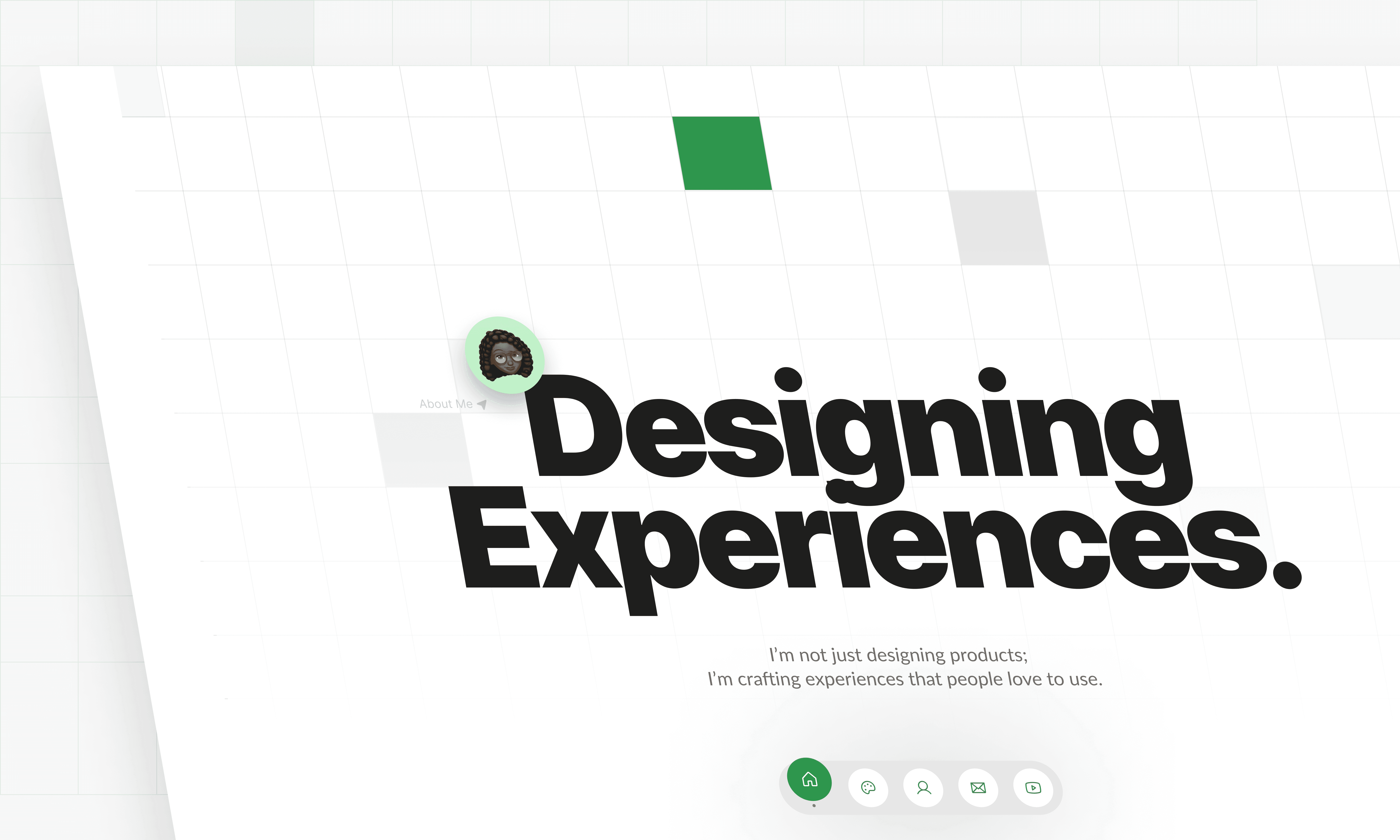
As a product designer, my portfolio serves as a vital showcase of my skills, experiences, and design philosophy. But creating a portfolio isn’t just about displaying work; it’s about crafting a user experience that resonates with visitors.
In this article, I’ll take you through the thought process behind my design portfolio, highlighting how I applied user-centered design principles to create a space that not only reflects my style but also engages and guides visitors effectively.
UXing My Portfolio - My Process
From the layouts to structure to storytelling, paying attention to these things are very important to show you know what you are doing. Here are the things I'll cover in this article.
Understanding User Needs
Key UX Principles Applied
Iteration and Feedback
Final Thoughts
Understanding User Needs
Identifying My Audience
When creating my portfolio, I knew that different audiences would be exploring my work, each with distinct goals and interests. My audience includes recruiters, design founders, agencies, and fellow designers, so I structured my portfolio to help each type of visitor quickly find the information most relevant to them.
To achieve this, I created dedicated navigation tabs at the top of the page labeled: For Anyone, Agencies, Recruiters, Founders, and Designers.
These tabs guide users to sections best suited for their needs, showcasing work and information tailored to their unique perspectives. By prioritizing audience-specific navigation, I aim to make each visitor’s experience more efficient and engaging, ensuring they can access content that resonates with their interests.

Picture of the top navigation tabs with a big figma arrow on it
Conduct User Research
For my portfolio, I took a practical approach to understanding user needs. Instead of diving into primary research methods—surveys, heatmaps, and all the technical stuff that complex projects require—I leaned on secondary research. After all, this is my personal portfolio, not a high-stakes fintech product!
I explored articles, documentaries, ebooks, and roadmaps created by experienced designers to understand what different audiences look for in a portfolio. Through these insights, I discovered what recruiters, agencies, designers, and even founders prioritize.
For example, I learned that recruiters tend to appreciate detailed documentation of my design process, while agencies are more interested in visual results. So, I tailored each section to highlight what would impress and avoid what could potentially frustrate each type of visitor.
By adapting my portfolio to meet these varied expectations, I aimed to create an experience that feels both intuitive and engaging for every audience type.
Defining User Goals
Using the insights gathered from my research, I outlined the unique goals of each type of visitor to ensure my portfolio meets their expectations.
For recruiters, the main goal is to get a clear sense of my skills, experience, and design approach. They’re especially interested in my design process and case studies, as these provide insight into how I tackle challenges and deliver solutions.
For founders, their focus is often on my ability to design user-centered products that align with business goals. They’re likely interested in seeing how my work can contribute to a bigger vision, so I highlight projects where my designs helped solve real-world problems or added value to the user experience.
Agencies are generally more results-oriented. They want to see the visual impact and final outcomes of my projects to gauge my style and ability to deliver polished designs. To keep things efficient, I tailored this section to focus more on project visuals and outcomes rather than extensive documentation.
Finally, fellow designers may visit my portfolio looking for inspiration or insights into my workflow. For them, I include sections on my design philosophy, detailed case studies, and insights into my process to encourage a meaningful exchange of ideas and techniques.
By understanding these distinct goals, I crafted a portfolio that speaks directly to each type of visitor, allowing them to find what they’re looking for quickly and easily.
Simplifying Navigation
With web users, especially those reviewing extensive portfolios, I know that scrolling through a long design process can feel like a marathon.
To make the experience seamless and efficient, I implemented a fixed side navigation for projects with lengthy documentation. This allows visitors to jump straight to the sections that interest them, saving time and offering a more intuitive journey.
To make navigation even more engaging, I took a storytelling approach to the labels, giving each section a conversational twist. For instance, instead of the standard “Introduction,” I went with “Where It All Began.” The “Problem” became “Okay…So What’s the Problem?” and “Goal” turned into “But Here’s My Plan.”
These personalized labels bring a bit of personality to the documentation, making the process feel more like a story than a formal report.
Picture of the side navigation from the project Tapijt & kelim
By designing the navigation with both clarity and personality, I hope to make exploring my portfolio a smooth and enjoyable experience, allowing each user to find what they need without missing a beat.
Applying Key UX Principles: Clarity and Consistency
Clarity was central to my portfolio design, ensuring users could navigate effortlessly without confusion. To achieve this, I focused on several factors: I chose legible fonts for easy readability and avoided harsh contrasting colors, which can be distracting or straining on the eyes.
Additionally, I used clear labels and straightforward headings, kept the layout simple to avoid visual clutter, and applied consistent spacing to give each element room to breathe. Together, these choices create a clear, accessible experience, helping users find what they need with minimal friction.
In addition to clarity, I emphasized consistency throughout my portfolio, especially within the project documentation. All projects under the main tabs follows a similar layout, allowing users to immediately perceive the relationship between the categories and easily understand the structure.
This cohesive layout not only reinforces familiarity as they browse but also enhances predictability, ensuring users can focus on the content rather than re-learning the layout with each section.
Picture of the layout of projects under "For Recruiters" Tab
Picture of the layout of projects under "For Agencies" Tab
Iteration and Feedback
At the beginning of building my portfolio, I initially had a single page showcasing all my projects. However, after sharing it with a few designer and non-designer friends for feedback, I received insights that reshaped the design.
One comment stood out: “Having all the projects on one page made it seem a bit much, almost like all the projects were similar, especially since the first one was geared toward recruiters.” This led me to introduce the top navigation tabs, allowing users to explore categories specific to their needs and guiding them directly to the projects most relevant to them.
Another valuable suggestion came up about project documentation. Some friends found certain documentation too long to read and expressed a desire to jump to specific sections. Based on this, I created a fixed side navigation within each project for recruiters, enabling users to quickly access the parts of the documentation that interest them most.
Lastly, I received indirect but incredibly useful feedback on my About page. Inspired by Mollie Cox’s 2024 Design Portfolio Playbook, particularly her insight on “10xing your portfolio with the About page,” I realized the potential of enhancing this section. I restructured it to tell a more personal story, covering my journey, design philosophy, and values.
A big bonus was creating a video for the About page, allowing viewers to connect with me as a person and team player, not just a designer.
Your Thoughts Matter 💚
I’m always eager to connect with fellow designers, recruiters, and anyone who’s passionate about design. If you’ve explored my portfolio, I’d love to hear your thoughts—whether it’s feedback, questions, or insights into how I can continue improving the user experience.
Feel free to reach out or connect with me on social media, and let’s keep the conversation going!