Modern Aesthetic
Create a clean and contemporary website design that reflects the company's brand and values
Seamless User Experience
Improve the user flow, ensuring a smooth transition from the landing page to the checkout process.
Increased Conversions
Enhance the website's overall effectiveness in driving sales and generating revenue.
Yay!
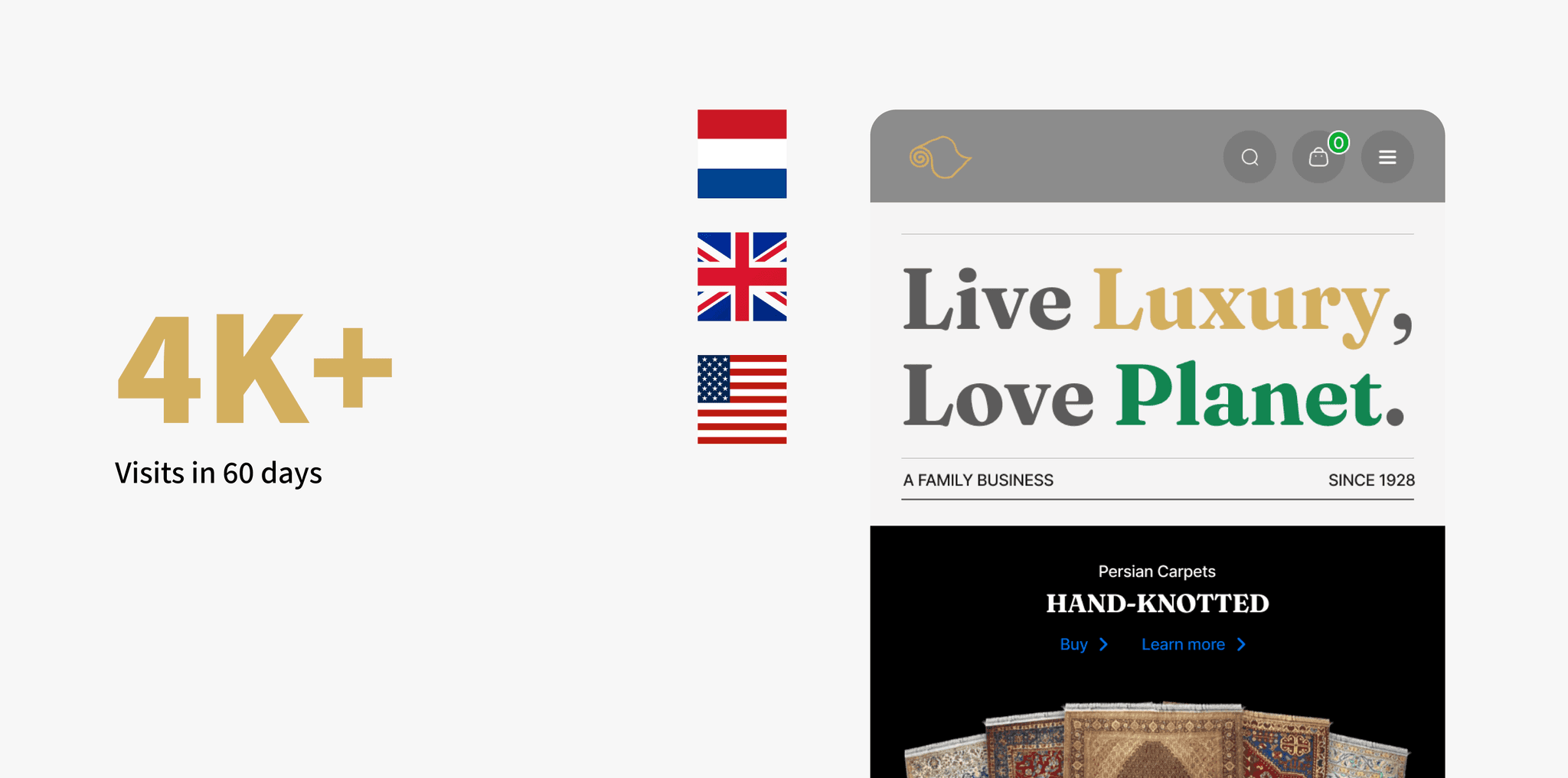
We launched the landing page on June 14, 2023! For confidentiality reasons I have omitted the actual values for these metrics.
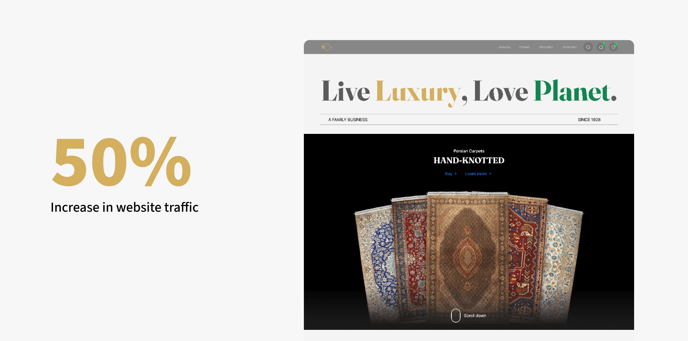
Increased Website Traffic
The redesigned website experienced a 50% increase in organic traffic within 3 weeks compared to the old website, demonstrating improved discoverability and user engagement.
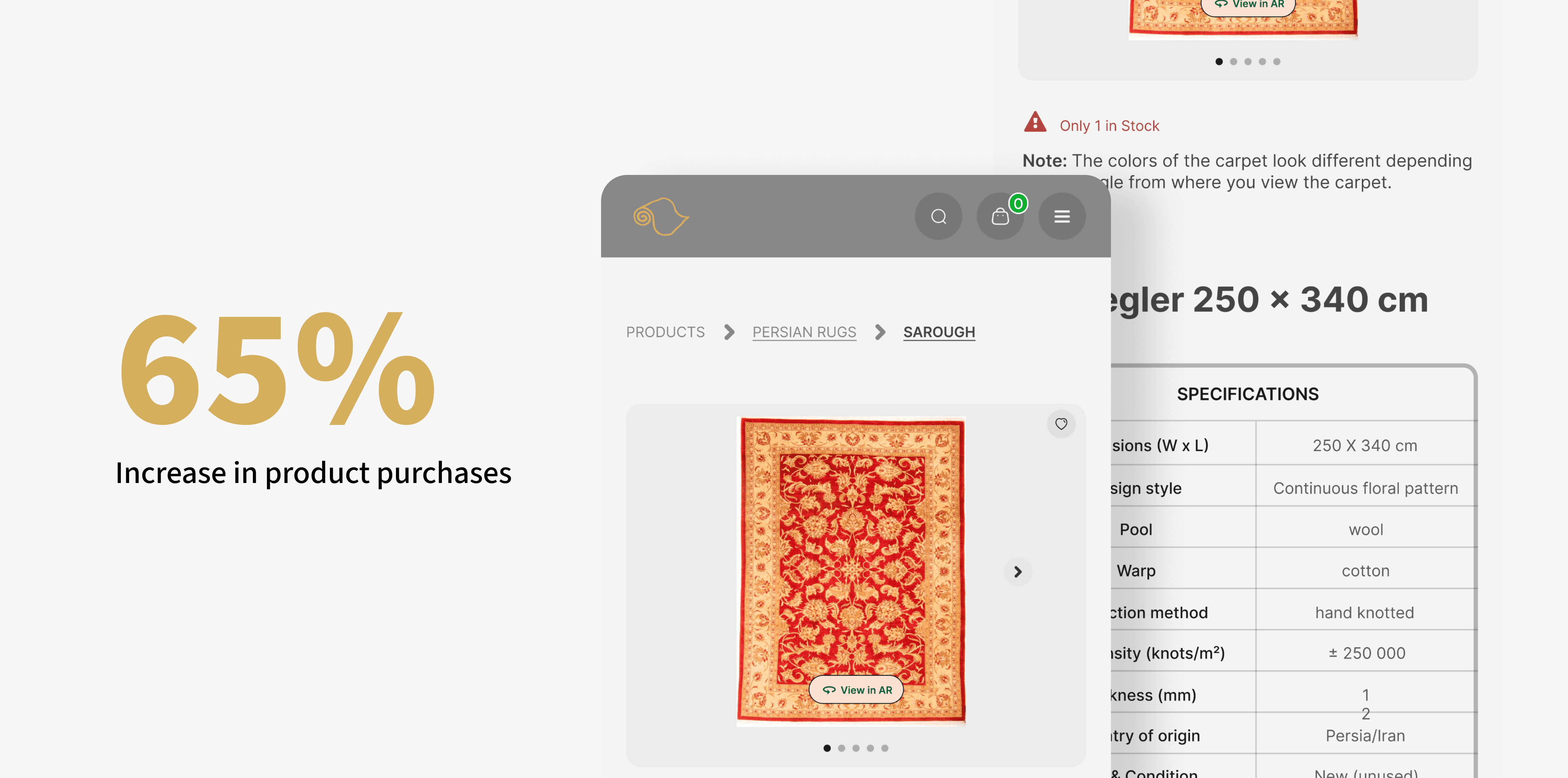
Boosted Conversions
The redesign led to a increase in product purchases by 65% (since we got stats that 65% of the users completed their purchase), directly contributing to the business's bottom line (decrease in cart abandonment or drop-offs).
Improved Brand Perception
User feedback and analytics showed a positive shift in brand perception, with visitors perceiving Tapijtenkelim as more modern, professional, and trustworthy.

Design Sprint
I started by learning about Tapijtenkelim, its competitors, and their brand. I looked at the old website, compared it to others, and learned about their brand's style and values.
Using Miro and FigJam as a remote collaboration tool, I gathered inspiration of how other forward-thinking brands craft their landing page, and shared what I liked about them.
Then, I did a quick solution sketching together to end the sprint. This mini design sprint was condensed into 2 hours as our schedule were packed.
On a separate session, I established 4 design principles for the landing page to make sure I design based on these principles. These principles are centered around our consumers—How consumers portray us as a brand.
I started sketching some crazy ideas on our minds. Our focus at this stage is to diverge first, converge later.
Brainstorming and Planning
I used mind maps to organize my ideas and talked to potential customers to understand their needs. I wanted to know what they liked and didn't like about the current website.
Initial Ideas
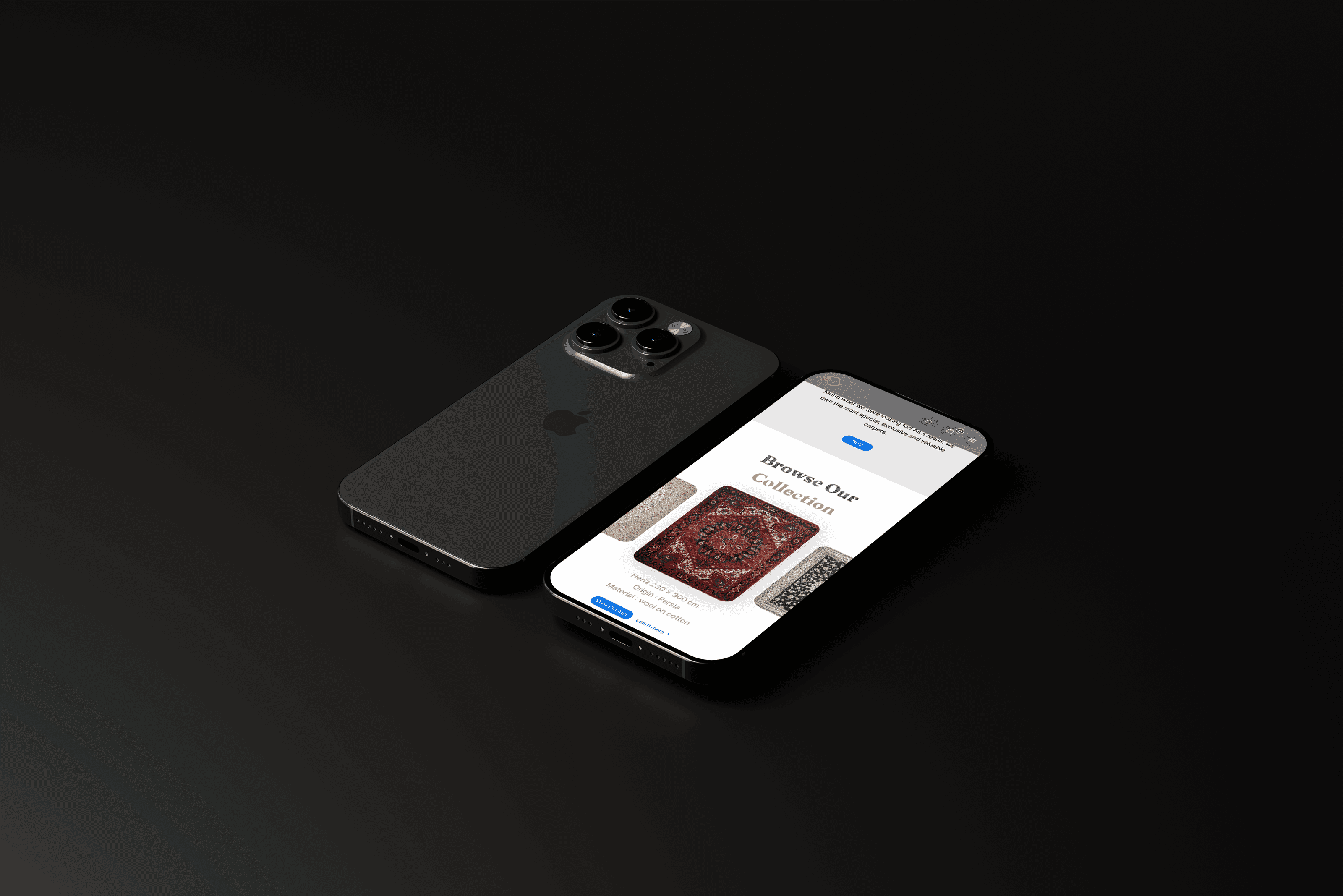
I drew and sketched different ideas for the website. I focused on how to present the rugs, make navigation easy, and make it simple to buy.
I looked at other websites that sell luxury items to get ideas. I wanted to make the website look modern and use high-quality photos.
Key Findings
I learned that people wanted a beautiful website that showed the rugs well. They wanted easy navigation and clear information about the rugs.
I conducted user tests with 5 people outside Fave using Maze's Survey tool. To avoid bias, I changed the brand to 'Plus', swapped the brand color to blue, and tweaked the copy so responses are more accurate. This is what the survey looks like. It's easily shareable via a link.
Survey-Based User Feedback:
I consolidated the test results on Notion. A heatmap is also generated to help us understand how people interact with the landing page.
Here are the results!
I analyzed the survey responses to identify trends, areas of strength, and opportunities for improvement.
Heatmaps
From the heatmap, we found that 20% of users scroll to the bottom. We were worried people won't notice some clickable elements, but the heatmap results proved otherwise.
By asking specific questions in the survey without revealing that we are Fave, we found that people were able to understand what the product is about.
In Malaysia, there are many e-wallets so people tend to consider Fave as one too, but we aren't. So in this landing page, we tell people that we don't store users' money. We also educate users to stack their rewards, leverage on Fave's full potential and unlock more savings.
And then, back to the artboard. I continued to iterate the designs to strengthen our value propositions and ensure all messaging are clear as crystal, while driving app downloads.
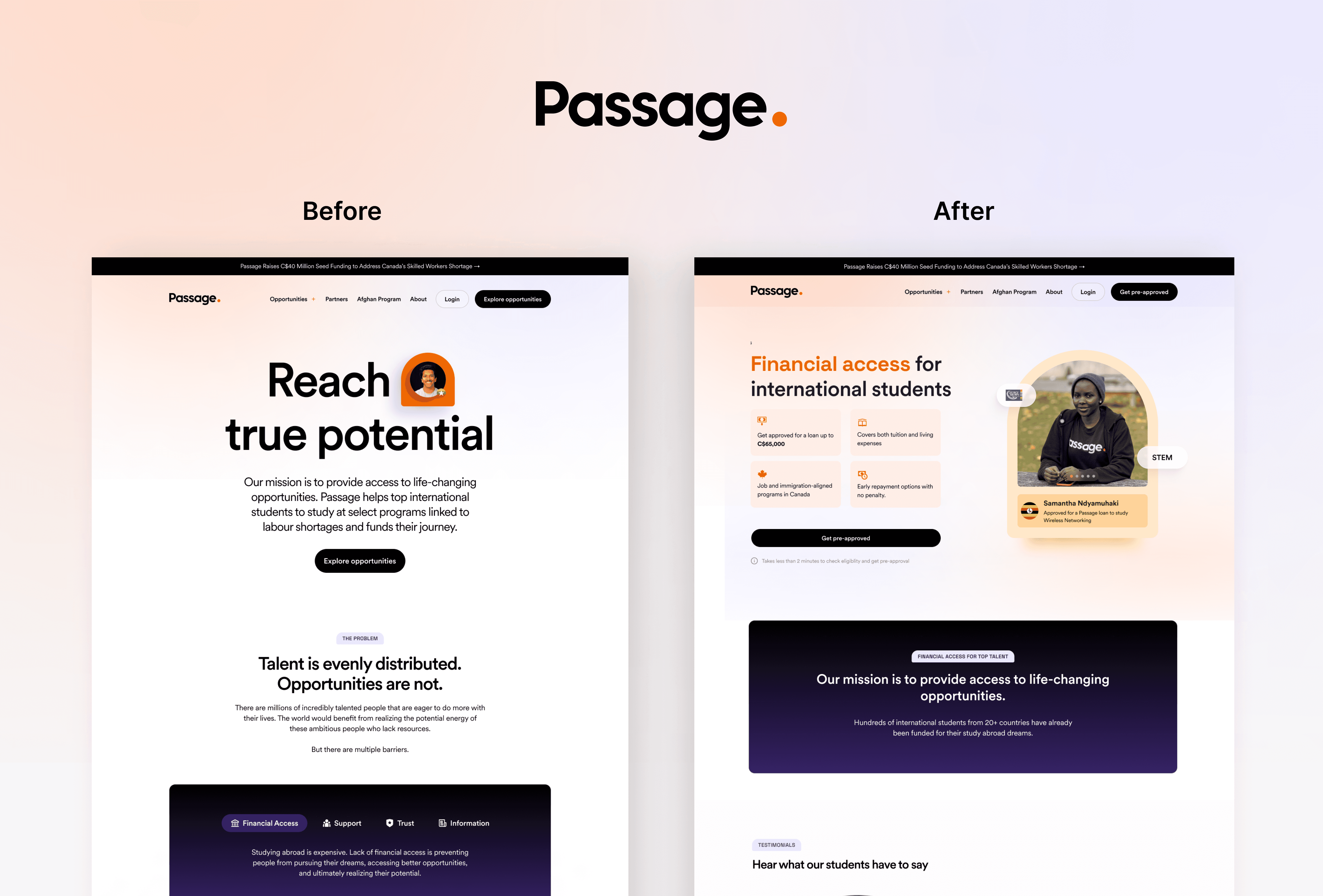
Before and after
Before the redesign, there was lack of focus on what Fave offers. The website was cluttered. The design language was inconsistent with the Fave app. It does not do justice to Fave's unique value proposition.
Here's a detailed walkthrough of what I improved post-testing.
Strong social proof
Social proof can be seen throughout the landing page. We've showcase familiar brands that visitors instantly recognize, real metrics of total savings from Fave's consumers, real app reviews and real testimonials.
I analyzed the survey responses to identify trends, areas of strength, and opportunities for improvement.
Relevant hero image
We placed different hero images in the mockups so the team can visualize how it looks like. We voted on the image that best reflects a smart, savvy Fave user, who's excited to save with Fave.
Improved Brand Perception
By asking specific questions in the survey without revealing that we are Fave, we found that people were able to understand what the product is about.
In Malaysia, there are many e-wallets so people tend to consider Fave as one too, but we aren't. So in this landing page, we tell people that we don't store users' money. We also educate users to stack their rewards, leverage on Fave's full potential and unlock more savings.
And then, back to the artboard. I continued to iterate the designs to strengthen our value propositions and ensure all messaging are clear as crystal, while driving app downloads.
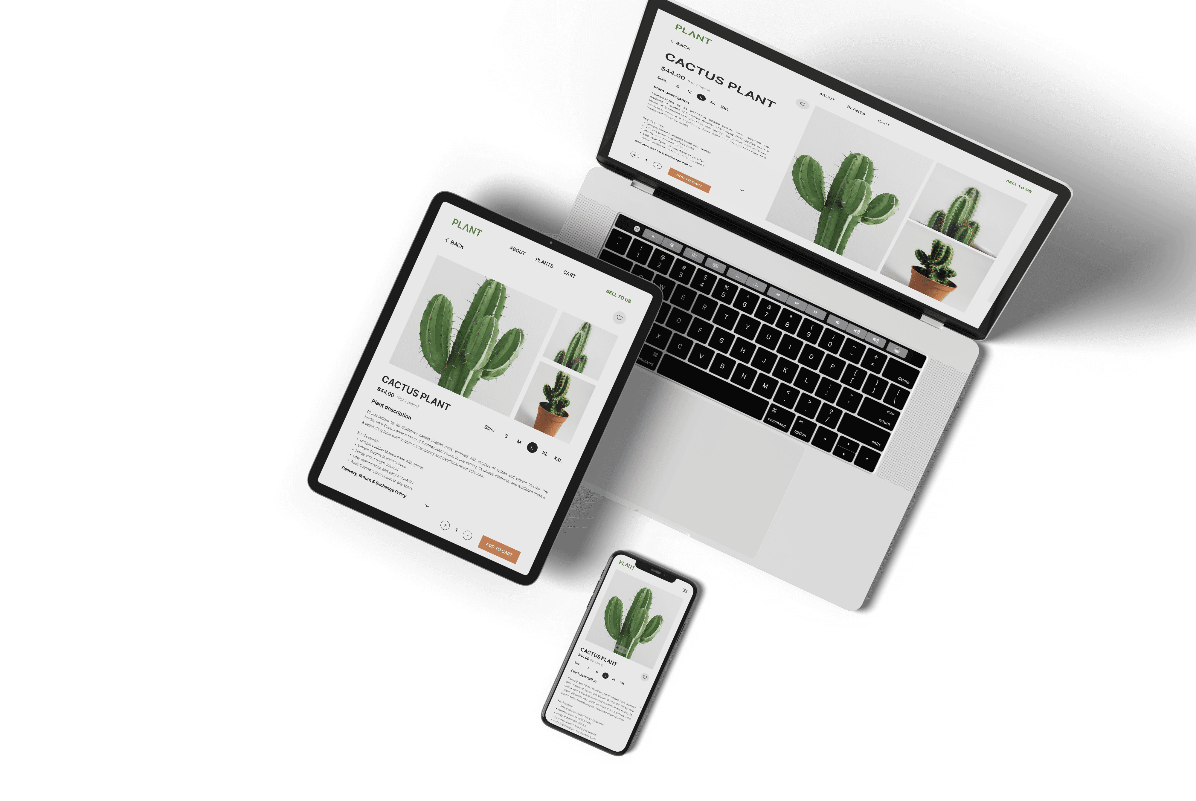
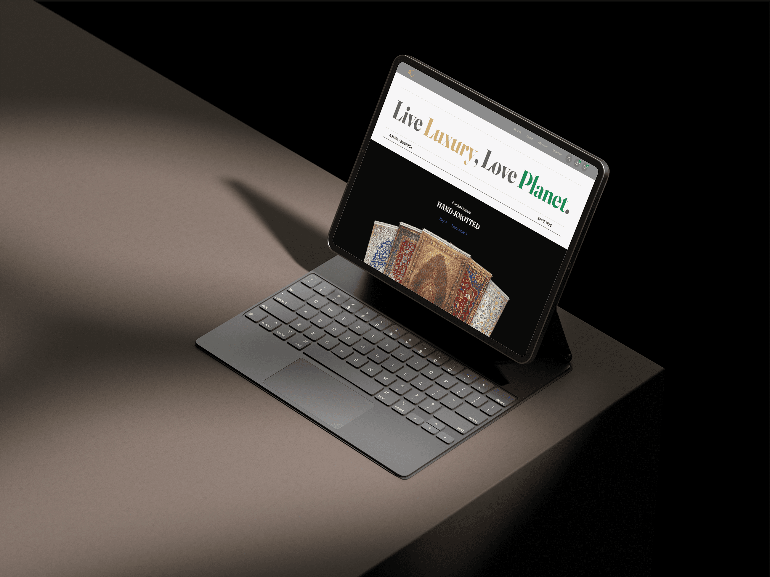
Responsive screen (Desktop & Mobile)
Before and after
Before the redesign, there was lack of focus on what Fave offers. The website was cluttered. The design language was inconsistent with the Fave app. It does not do justice to Fave's unique value proposition.
Here's a detailed walkthrough of what I improved post-testing.
Strong social proof
Social proof can be seen throughout the landing page. We've showcase familiar brands that visitors instantly recognize, real metrics of total savings from Fave's consumers, real app reviews and real testimonials.
Relevant hero image
We placed different hero images in the mockups so the team can visualize how it looks like. We voted on the image that best reflects a smart, savvy Fave user, who's excited to save with Fave.

Reach out on LinkedIn ↗