Project Overview
Hapidae is a family organization app that acts as a digital COO for parents navigating the complexities of co-parenting, household management, and work-life balance. Our mission was to design a tool that eases the mental load of parenting, especially for mothers, and fosters teamwork in modern households.
The heavy duties of being a parent
Modern family life is fast-paced and overwhelming. Parents, especially mothers, carry an invisible mental load of to-dos: school schedules, meal planning, shared tasks, self-care, household logistics… and still show up for work.
Most productivity tools are built for professionals, not parents. Our users needed a tool tailored to family dynamics: flexible, collaborative, and emotionally supportive.
We began with a Google Form survey that gathered responses from 98 participants. Here's what we uncovered:
95% were parents (mostly mothers)
83% said they felt overwhelmed managing family responsibilities
Top stressors: tracking school schedules, meal planning, missed tasks, and lack of help from co-parents
Most-used tools: Google Calendar, WhatsApp, paper planners (none integrated or family-focused)
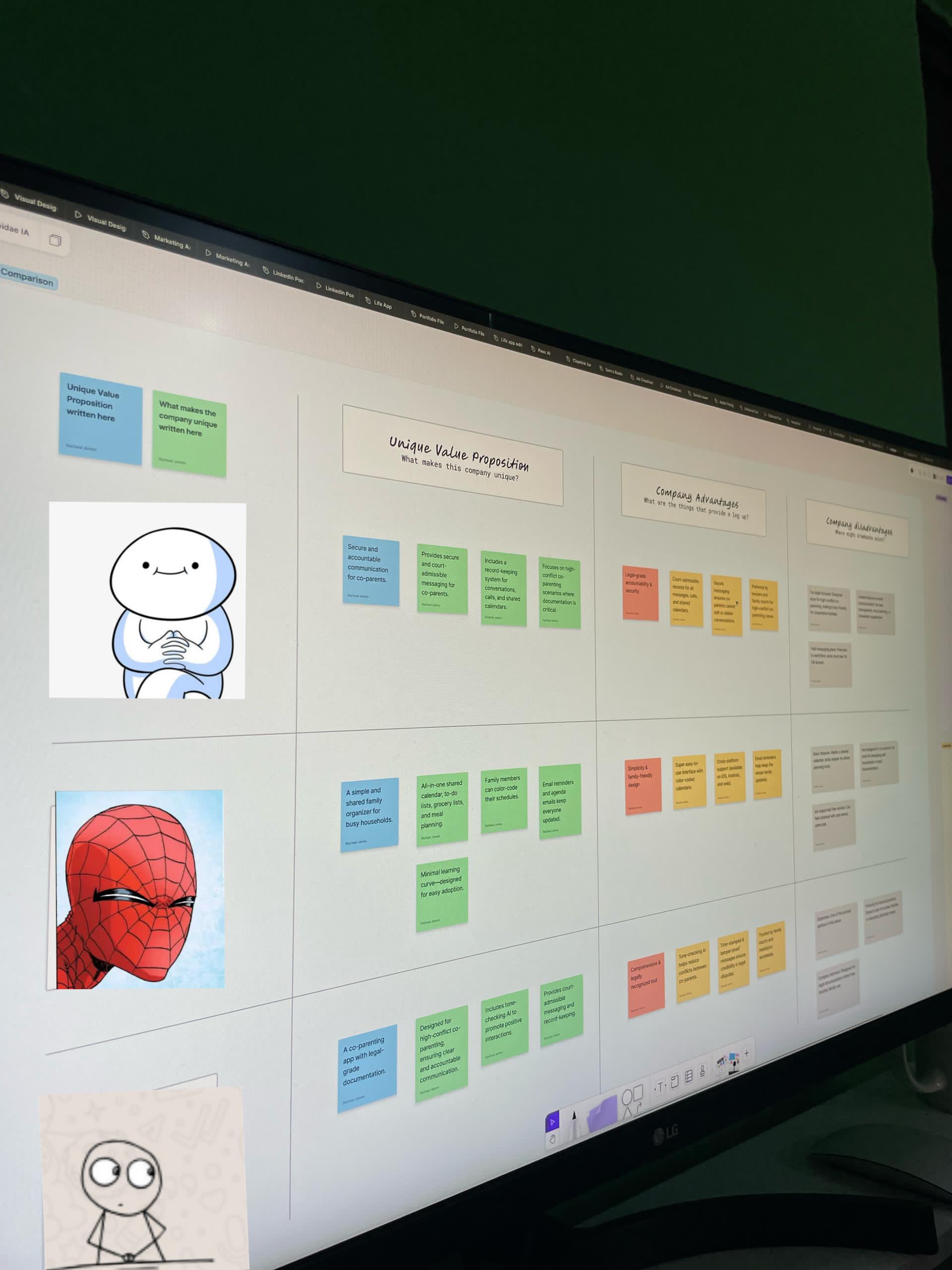
Comparison chart full view
Differences between the companies/brands
Notes of what i can learn from each company
The advantage of adding AI to such apps
What each brand have in common
Design a simple, warm, and powerful app that helps families:
Collaborate on shared responsibilities
Get a clear overview of their week
Reduce decision fatigue with preset options
Feel emotionally supported rather than judged
User Personas
We developed 3 key personas based on survey data:
Marianne — The Overwhelmed Mom
Nigel — The Clueless But Willing Dad
Tife — The Working Co-Parent Across Two Homes
Each persona had different needs, but they all shared one core desire: “Make my life easier, not more complicated.”
We mapped out key user flows and prioritized MVP features that would deliver clarity and calm:
MVP Features
Shared Calendar (sync with Google Calendar)
Tasks Management (with categories like School, Chores, Work, etc.)
Meal Planning (with food categories and day filters)
Self-Care Tracking (subtle nudges to check in with yourself)
Mood Logs (visual emoji-based logs to monitor emotional well-being)
Each flow was designed to feel lightweight and intentional, not overwhelming.
Snapshot of a simple user journey map
Wireframing Process
We used low-fidelity Figma wireframes to map out each screen, followed by detailed component-level design with states for:
Empty states
Completed tasks
Pending actions
New user walkthroughs
Snapshot of a few initial wireframes
Our visual language followed the principles of calm, clarity, and warmth.
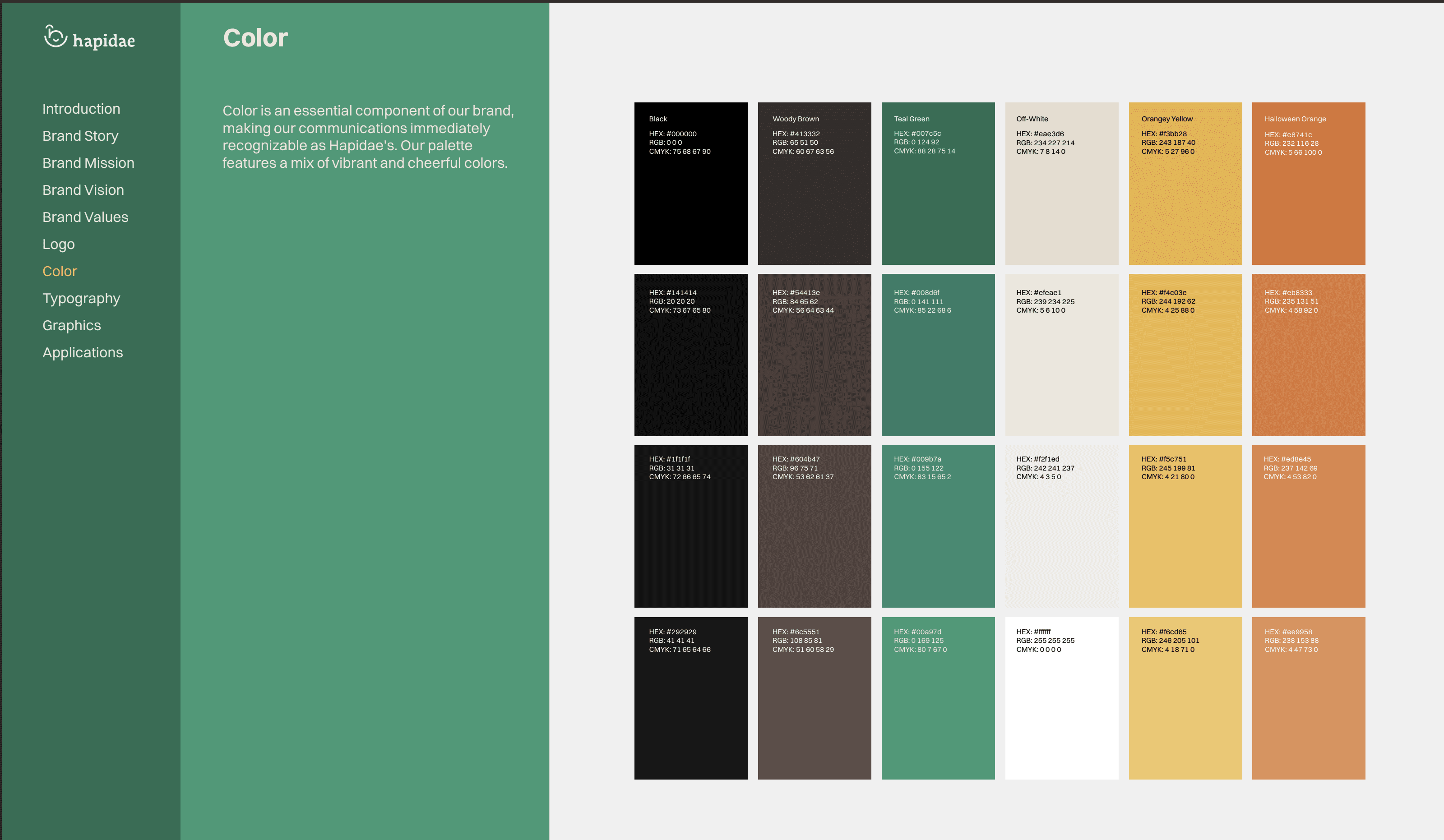
Color Palette
We used earthy greens, soft browns, and gentle oranges, tones that feel natural and grounding.
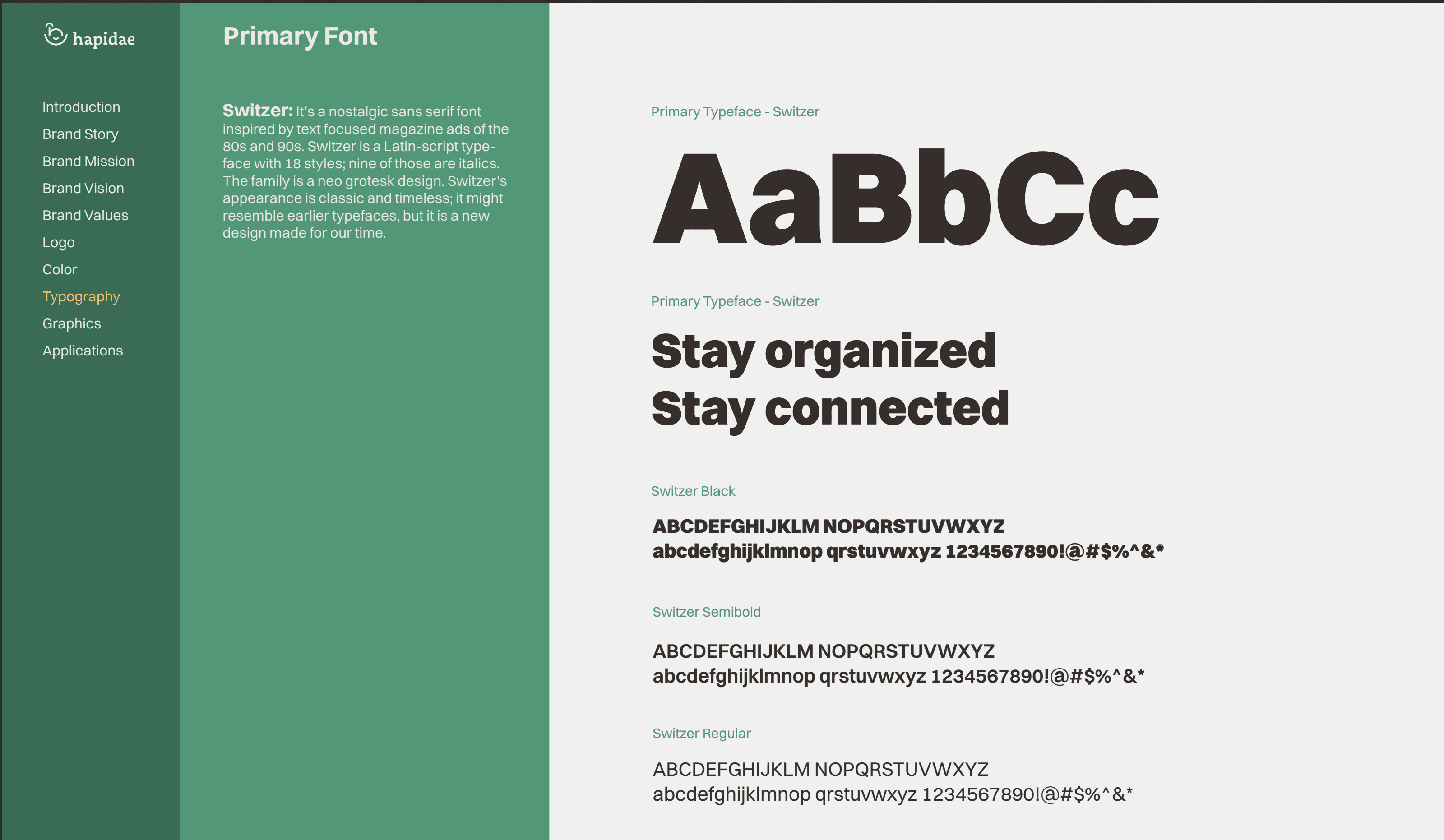
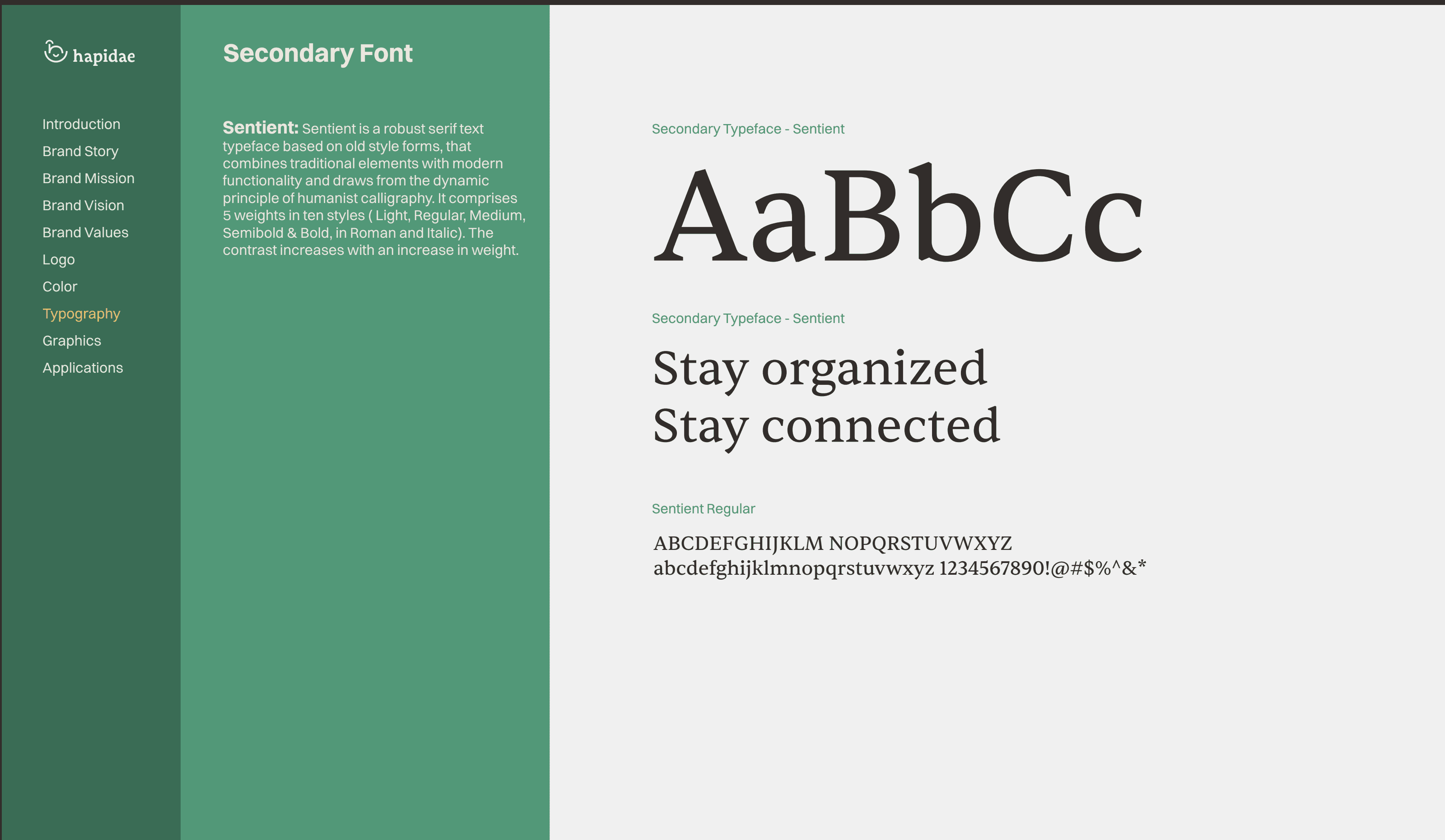
Typography
Sans-serif fonts for clarity and warmth. Legible across all screen sizes.
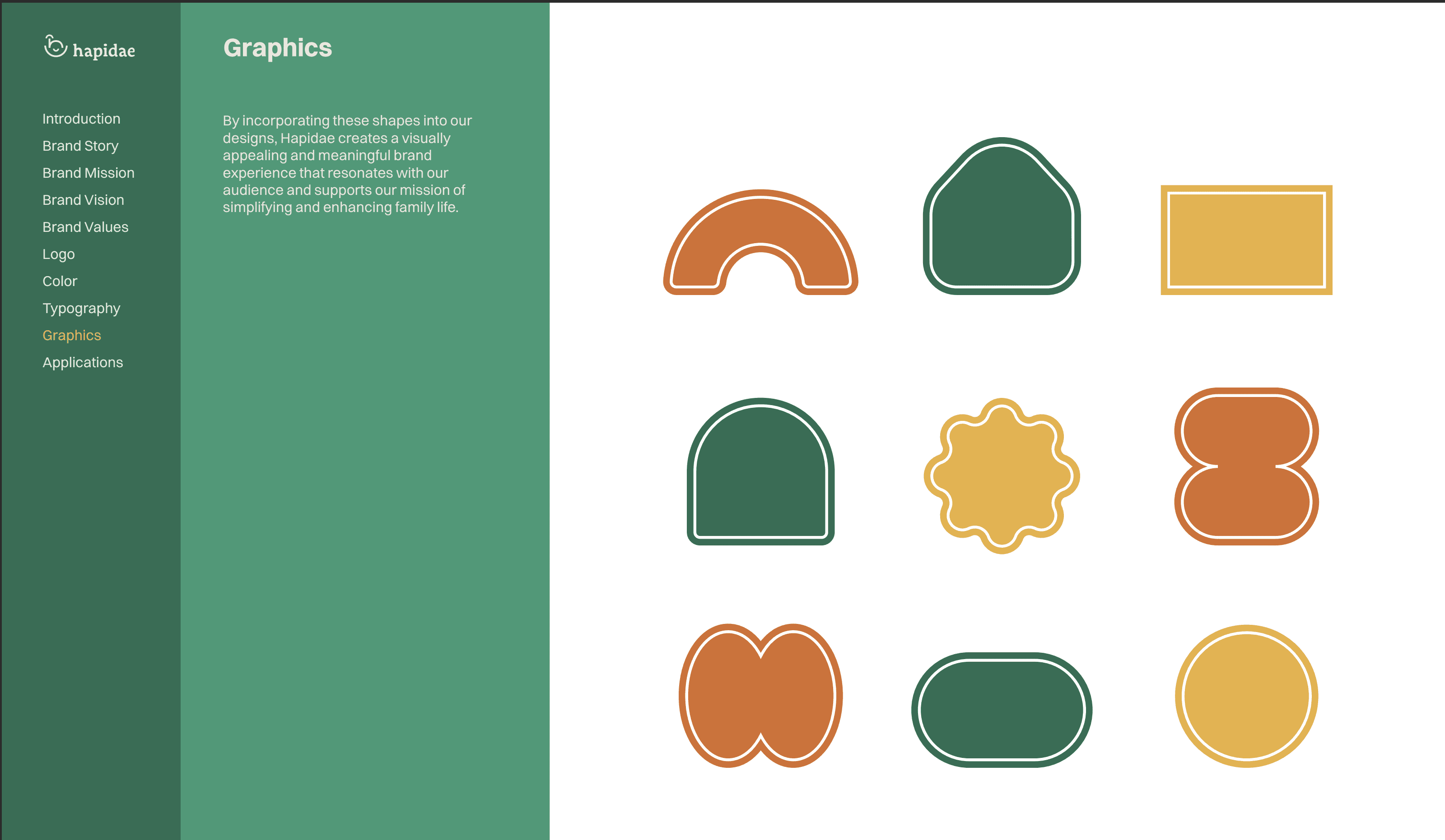
Illustrations & Icons
I used the minimalist digital illustrations provided in a consistent line-art style with pops of brand color. These visuals brought joy and understanding without clutter.
Animations were added for moments of success, onboarding, and mood tracking, subtle but meaningful.
Challenge 1: Parents Have No Time for Complex Onboarding
We kept onboarding to three short steps with clear illustrations and warm copy. A progress bar gave users a sense of control.
→ Result: Faster adoption and positive feedback on “how easy it was to get started.”
Challenge 2: Tasks Feel Like a Burden
We designed the tasks page to feel helpful, not demanding. Users could add tasks with suggested categories and add color-coded labels for mental organization.
→ Result: Users felt less guilt and more empowerment.
Challenge 3: Emotional Wellness Feels Taboo
We added a gentle self-check-in feature where users could log their mood using custom emoji illustrations (Happy, Okay, Tired, Sad). This helped normalize emotional honesty.
→ Result: Moms in particular loved this. “It made me feel seen.”
Outcomes
A functional, emotionally-intelligent UX flow built from real parent pain points
A cohesive UI system and brand aesthetic that feels premium but approachable
An early waitlist of users excited to test the beta
A strong foundation for expansion into features like co-parenting sync, school comms, and AI meal planning
Designing for parents requires deep empathy and radical simplicity:
When I first spoke to Lou (the founder), she told me something that stuck: “I just need help making life less chaotic.” That became my design compass. Every screen I created was filtered through this lens: Would a tired, multitasking parent find this easy, or would it add to their load? We trimmed unnecessary steps, reduced choices, and leaned into defaults, because simplicity is a luxury parents don’t often get.
Emotional design matters just as much as functional design:
The “mood tracker” wasn’t part of the original feature set, it was born from a user interview. One mom shared, “No one ever asks how I feel.” That moment hit hard. We added an emoji-based check-in system that let users log their emotions with just a tap. It didn’t just add a feature, it added care. And that’s what Hapidae is about.
Great UX is not just about usability, it’s about reducing the mental load:
It’s one thing to make an app usable. It’s another to make it feel like a helping hand. Every decision, like auto-suggesting task categories or showing meal types by day, was about offloading the micro-decisions that wear parents down. I wanted the app to feel like a second brain, not another task on the to-do list.
Working directly with a founder (Lou) showed me the power of collaboration between design and vision:
Lou didn’t just give me instructions, she shared her pain points, her parenting struggles, her goals. We co-created. I’d bring wireframes, and she’d tell stories behind them. That back-and-forth made the product stronger. It reminded me that great design isn’t just execution, it’s alignment.
Finalize beta-ready version for app testing
Continue refining based on live feedback
Collaborate with developers to ensure product-market fit
Explore partnerships with schools and parenting communities