Exploring luxury and a century-long tradition.
Tapijtenkelim is a website for a family-owned business that sells hand-knotted and hand-woven Persian rugs. The company was founded in 1931 by Assadollah Arjomandy. It is now run by his grandchildren, Tamara and Pooya
Importance: The website aims to showcase the company's rich history, high-quality products, and commitment to sustainability.
MY ROLE
I led the design, user testing and deployment of this project from end to end. I collaborated with a developer (Aram) during the early ideation stage and the CEO (Pooya) throughout the entire project.
Outdated design
The existing website design was outdated (It has not gone through a redesign for 4 years) and no longer aligned with modern design standards, potentially hindering user engagement and conversions.
Inefficient User Flow
The previous design lacked a seamless user journey, making it difficult for visitors to navigate from the landing page to the checkout process, leading to potential drop-offs.
Suboptimal Conversion Rates
The outdated and inefficient design was contributing to lower than desired conversion rates, impacting the business's bottom line.
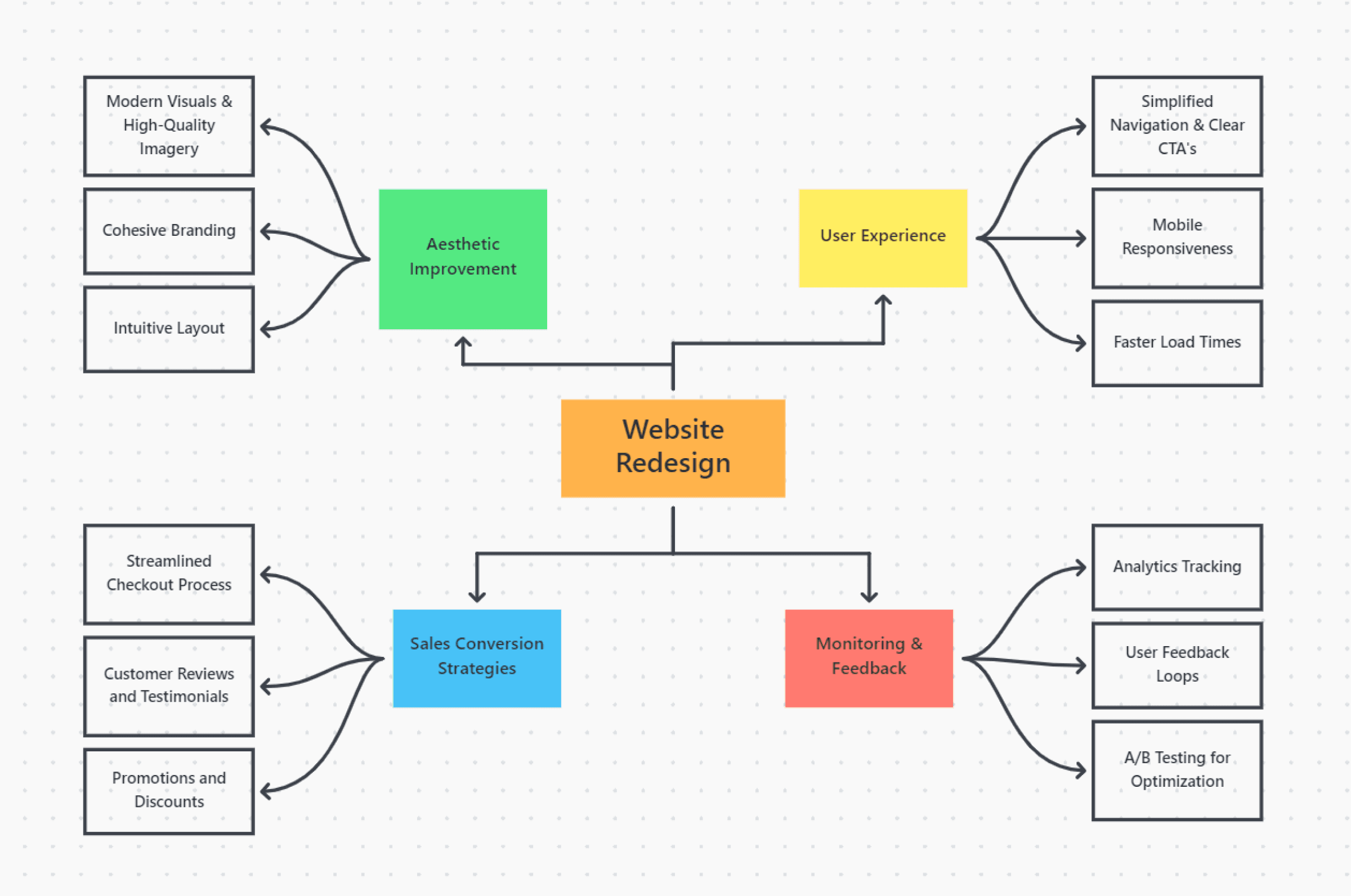
Modern Aesthetic
Create a clean and contemporary website design that reflects the company's brand and values
Seamless User Experience
Improve the user flow, ensuring a smooth transition from the landing page to the checkout process.
Increased Conversions
Enhance the website's overall effectiveness in driving sales and generating revenue.
Yay!
We launched the landing page on June 14, 2023! For confidentiality reasons I have omitted the actual values for these metrics.
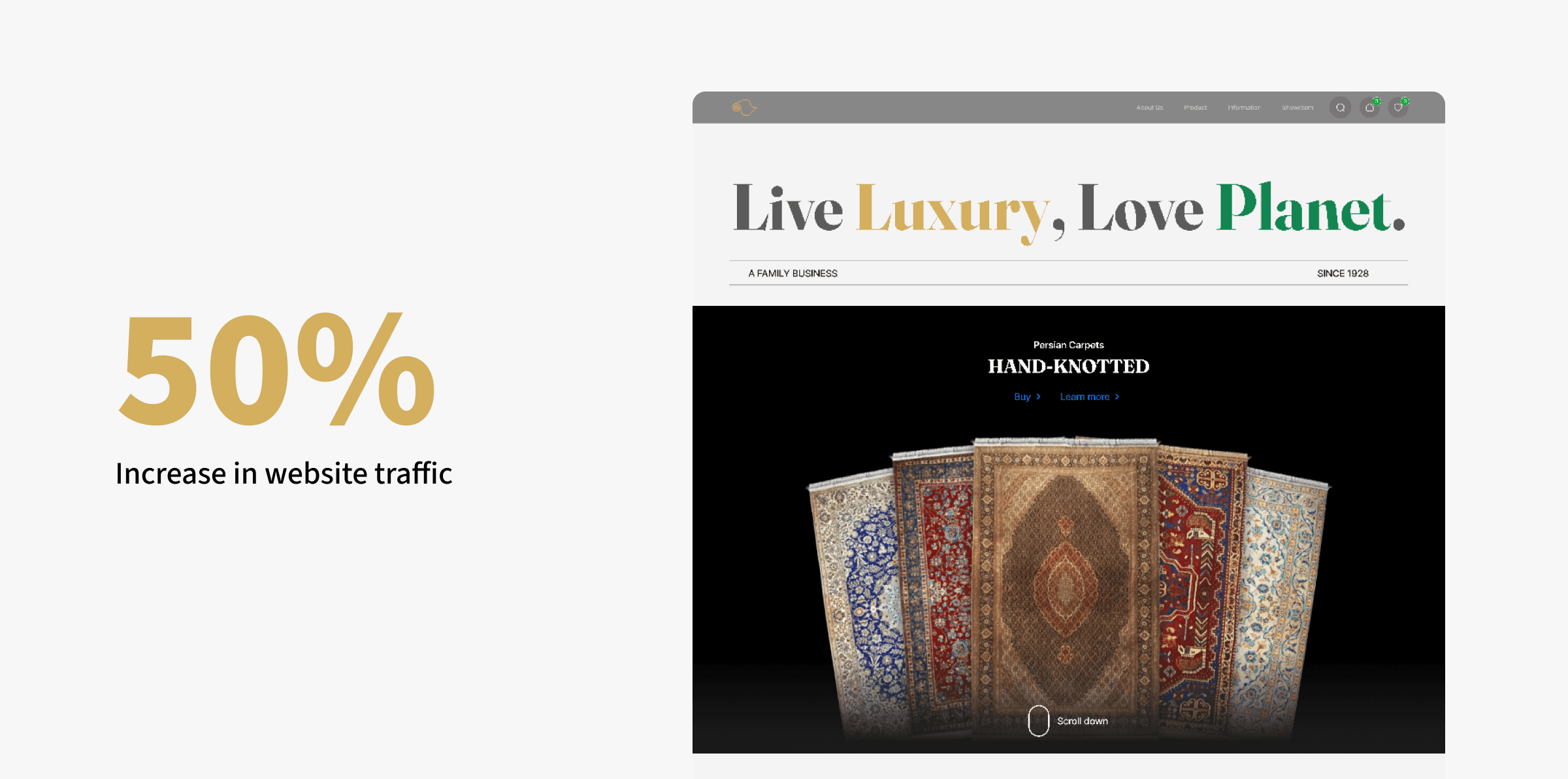
Increased Website Traffic
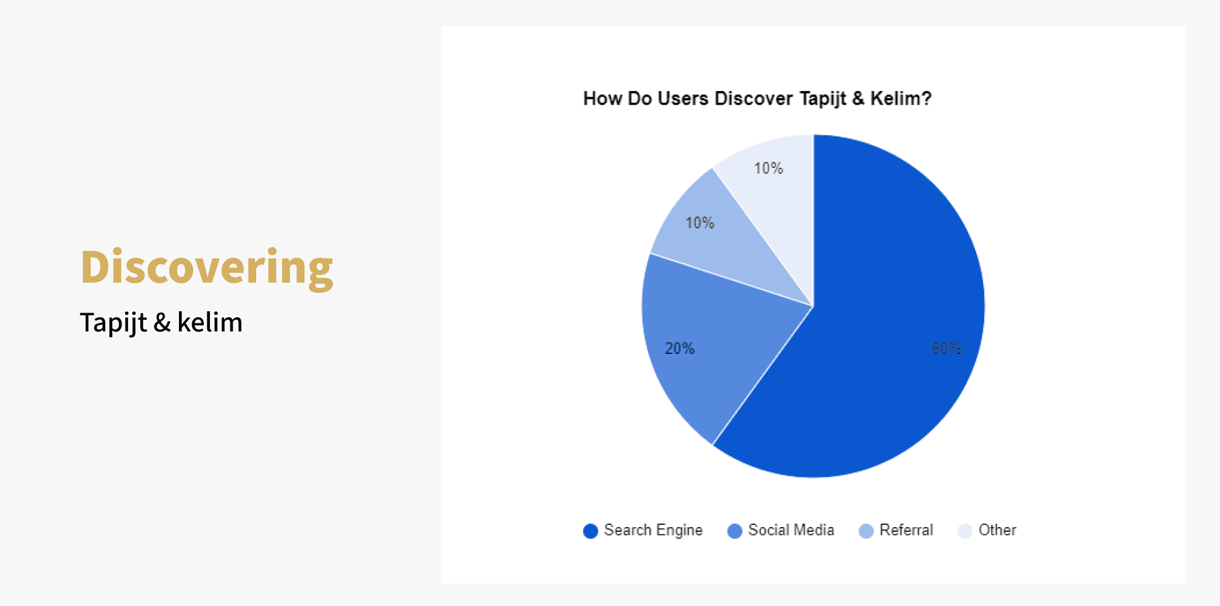
The redesigned website experienced a 50% increase in organic traffic within 3 weeks compared to the old website, demonstrating improved discoverability and user engagement.
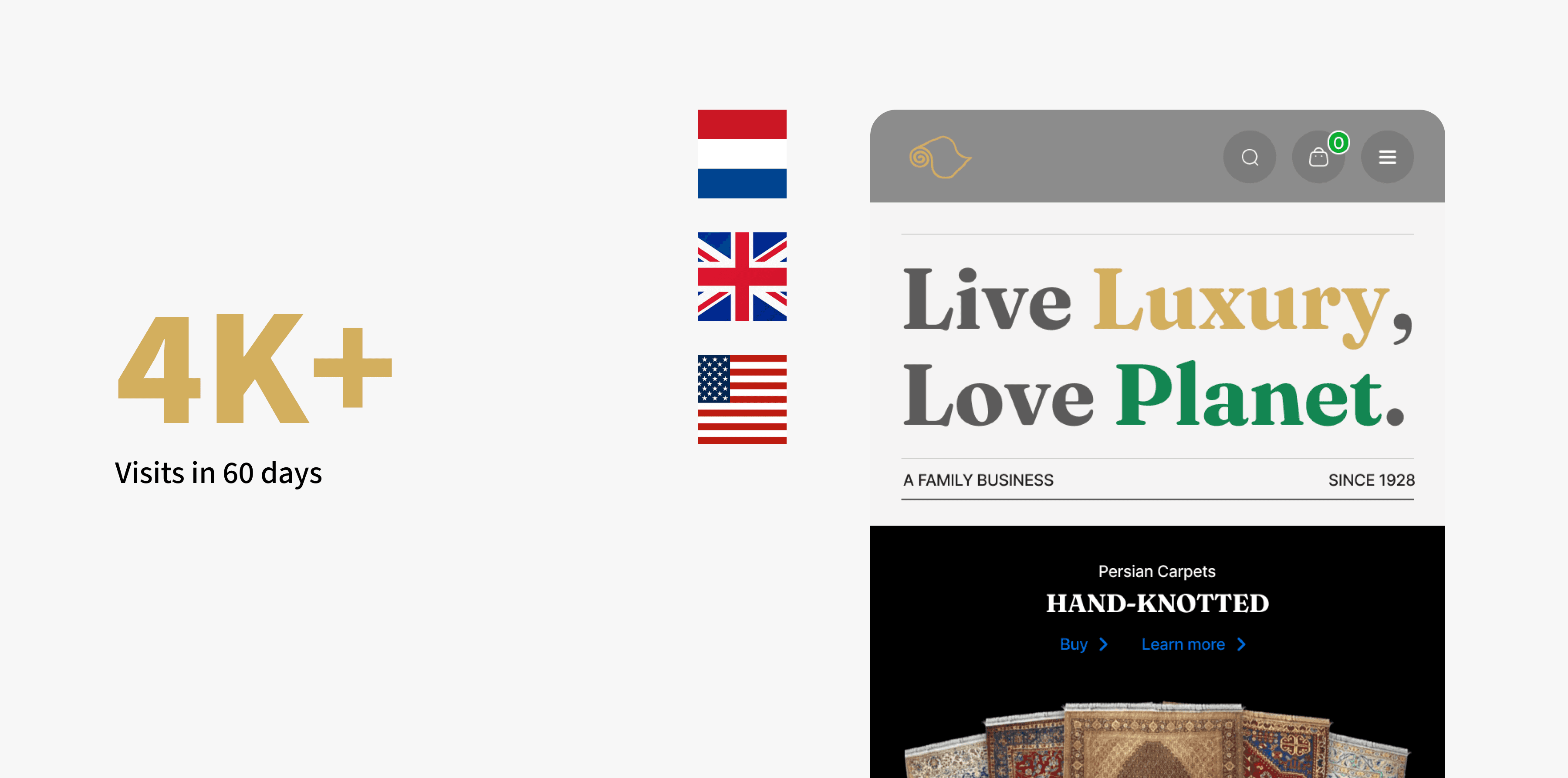
Visitors are mainly from Netherlands, United Kingdom, and United States.
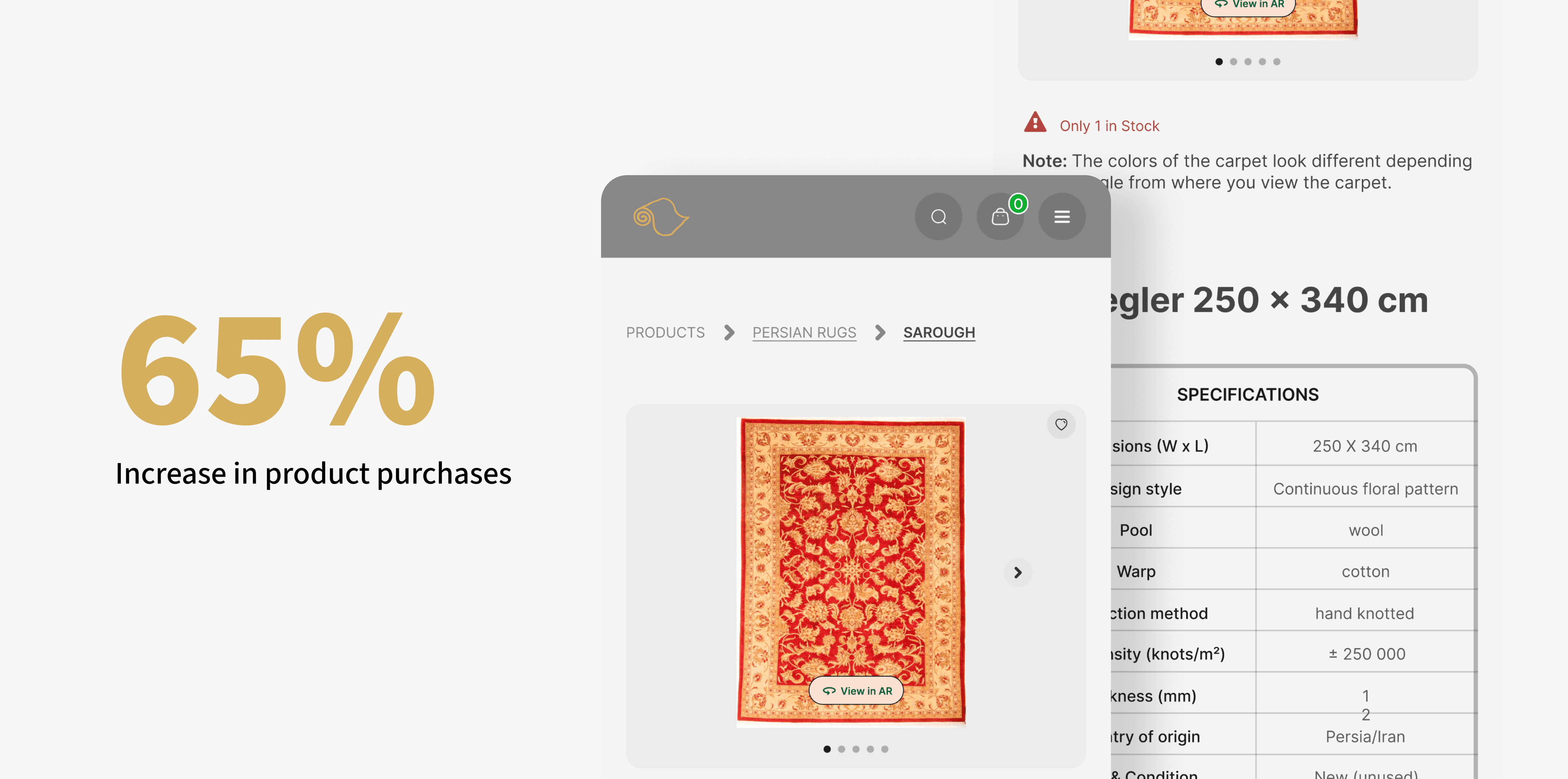
Boosted Conversions
The redesign led to a increase in product purchases by 65% (web analytics stats proved that 65% of the users completed their purchase), directly contributing to the business's bottom line (decrease in cart abandonment or drop-offs).
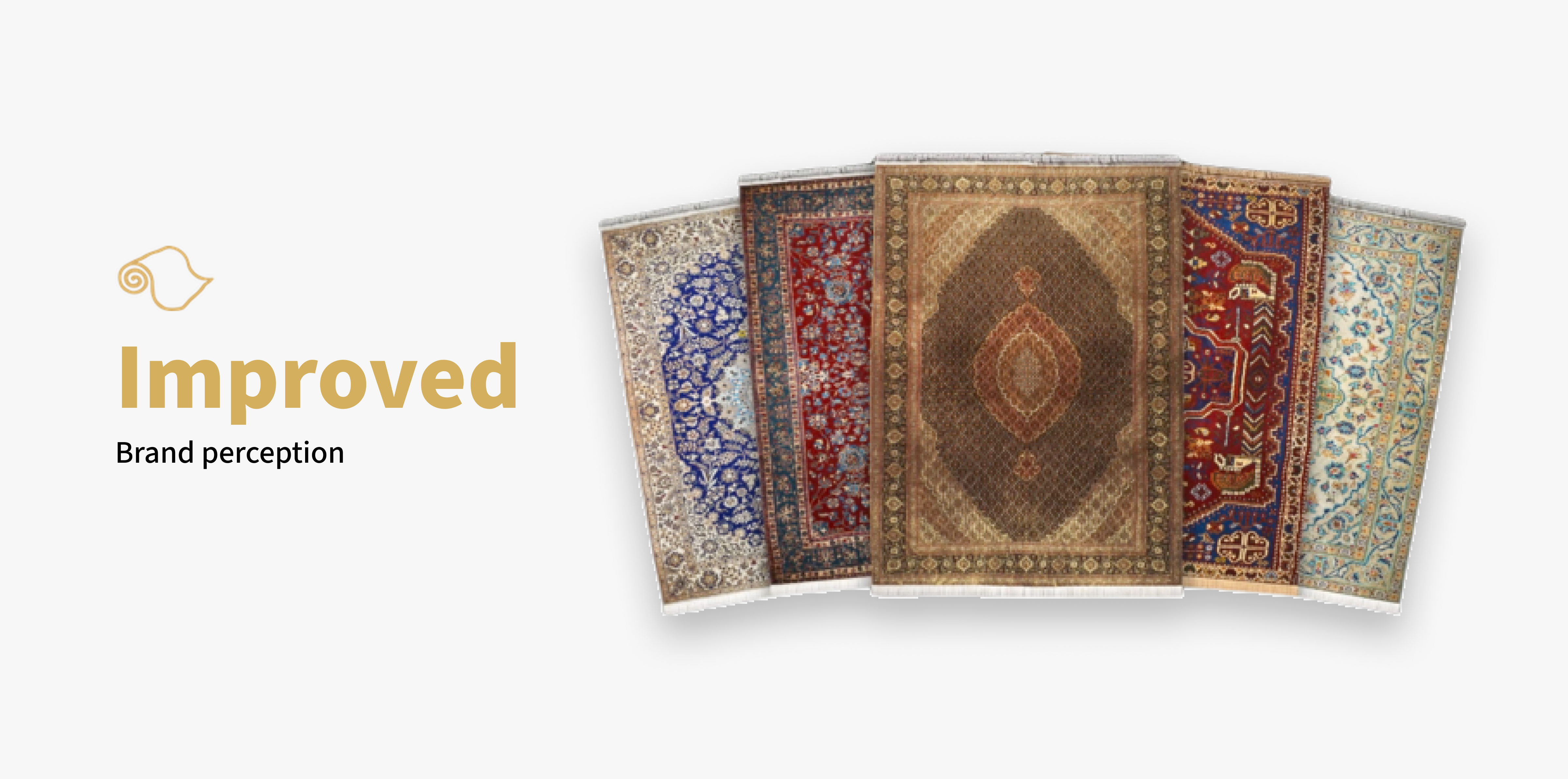
Improved Brand Perception
User feedback and analytics showed a positive shift in brand perception, with visitors perceiving Tapijt & Kelim as more modern, professional, and trustworthy.
Design Sprint
I started by learning about Tapijtenkelim, its competitors, and their brand. I looked at the old website, compared it to others, and learned about their brand's style and values.
Using Miro, FigJam & Xtensio as a remote collaboration tool, I gathered inspiration of how other forward-thinking brands craft their landing page, and shared what I liked about them.
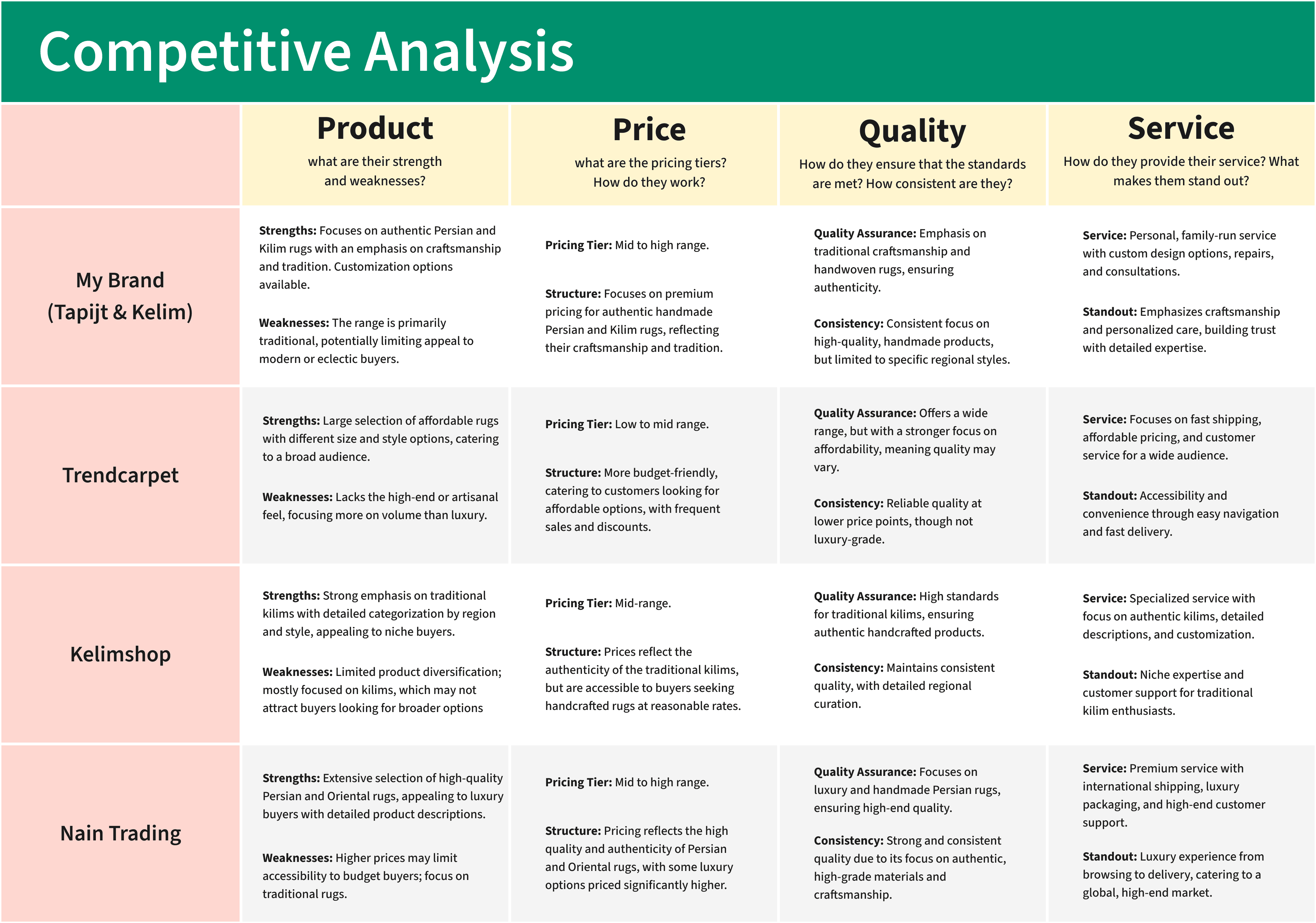
Comparison of my clients' brand and competitors' websites
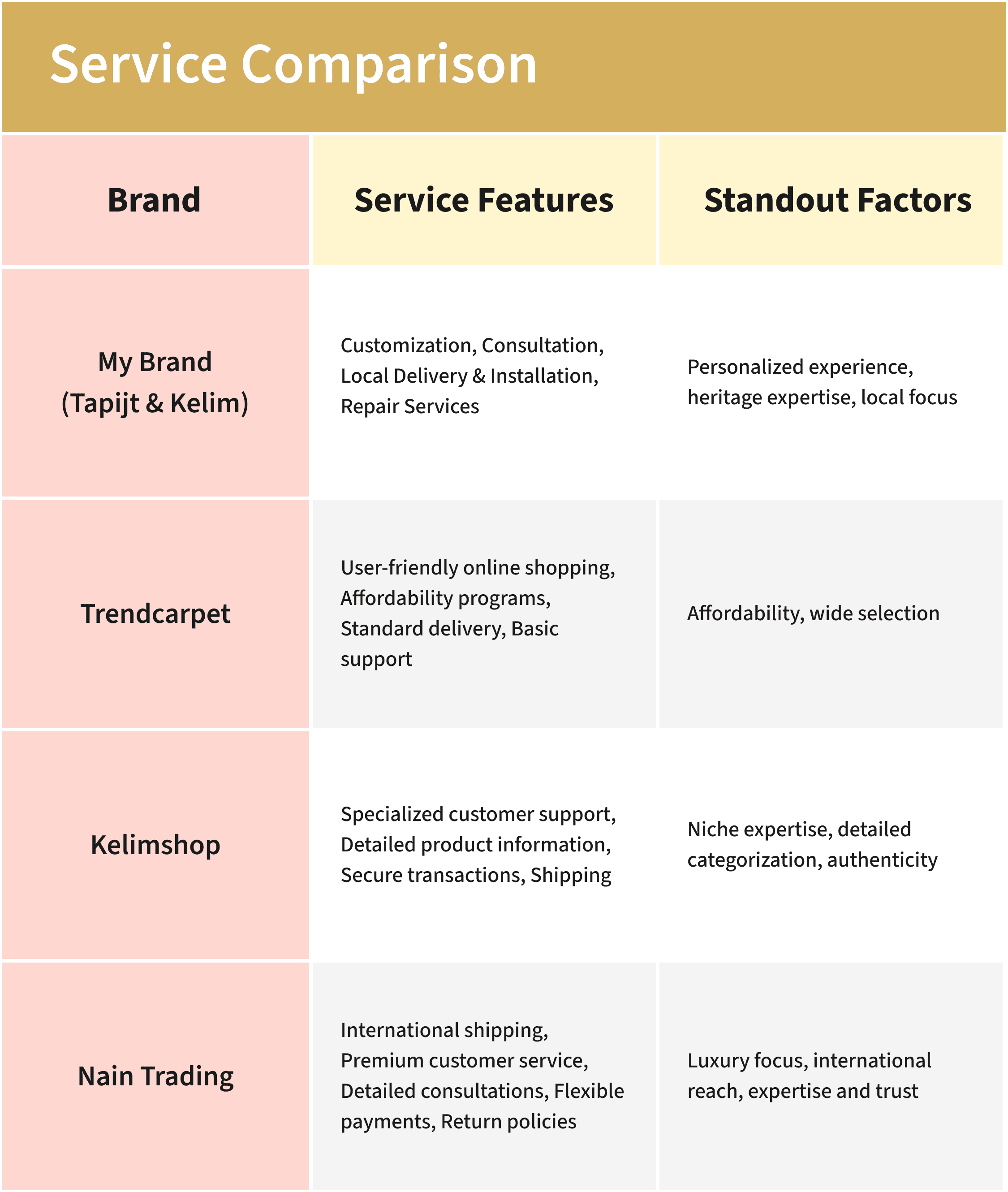
After working on my competitive analysis, I dived deeper into the service aspect of each brand
Then, I did a quick solution sketching together to end the sprint. This mini design sprint was condensed into 2 hours as our schedule were packed.
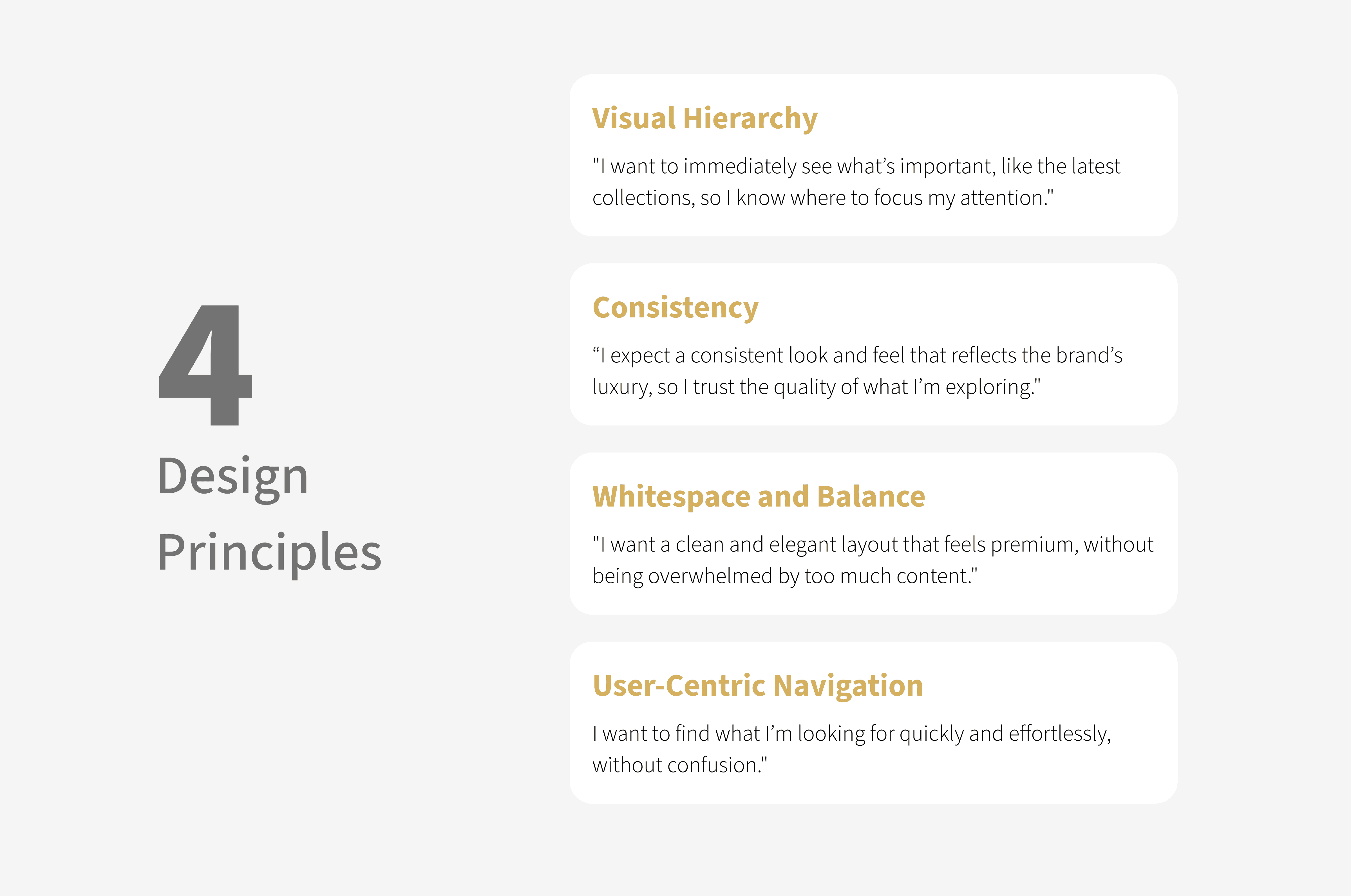
On a separate session, I settled with 4 design principles for the landing page to make sure I design based on these principles. These principles are centered around our customers—How customers portray Tapijt & Kelim as a brand and what they hope to achieve when looking to buy a rug.
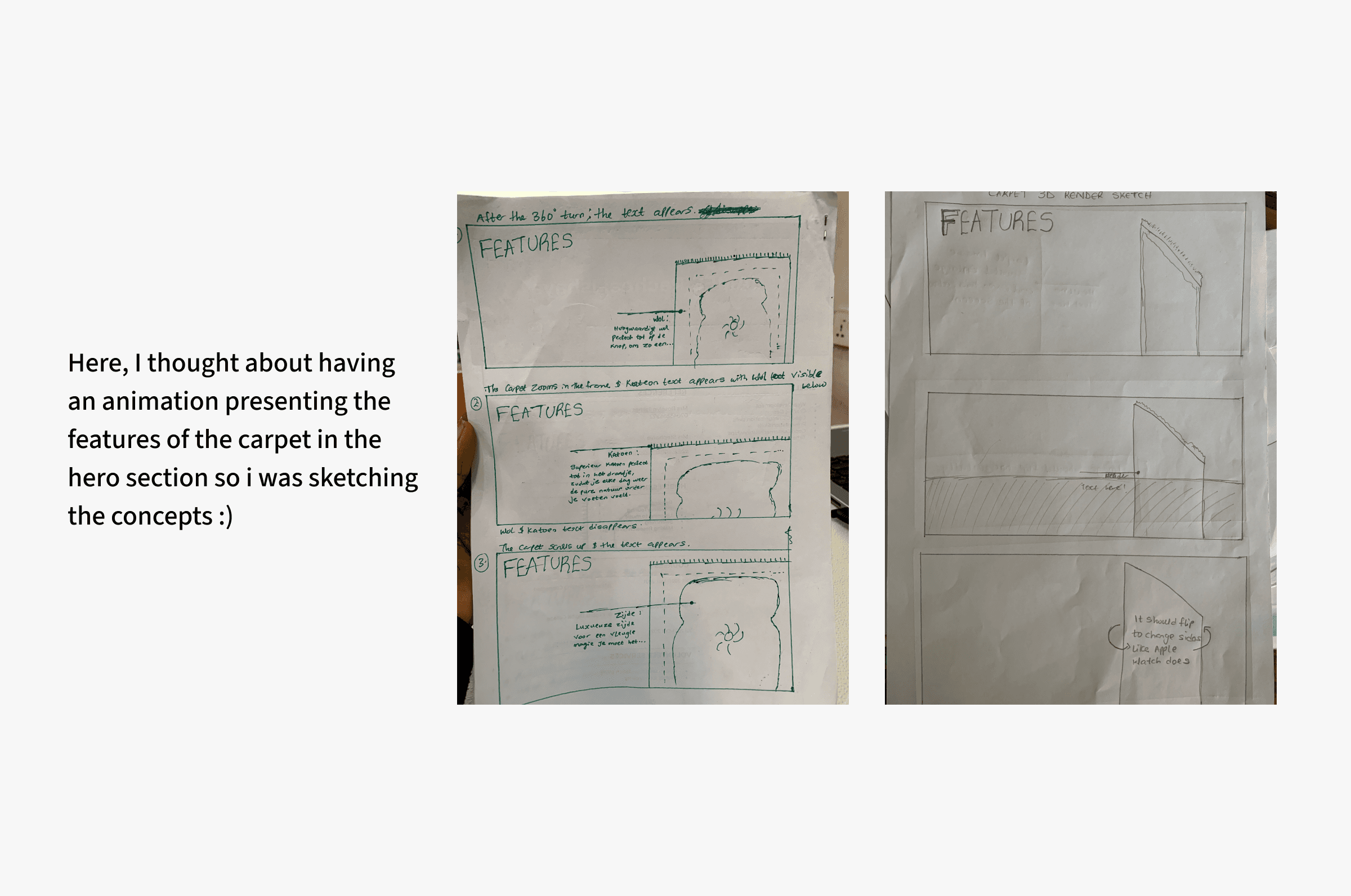
I started sketching some crazy ideas on my mind. My focus at this stage is to diverge first, converge later.
Brainstorming and Planning
I used mind maps to organize my ideas and talked to potential customers to understand their needs. I wanted to know what they liked and didn't like about the current website.
Initial Ideas
I drew and sketched different ideas for the website. I focused on how to present the rugs, make navigation easy, and make it simple to buy.

I looked at other websites that sell luxury items to get ideas. I wanted to make the website look modern and use high-quality photos.
Key Findings
I learned that people wanted a beautiful website that showed the rugs well. They wanted easy navigation and clear information about the rugs.
I conducted user tests with 15 people outside Tapijt & Kelim using Maze's Survey tool. I also conducted performance testing to measure page load times and optimize website speed for improved user experience and search engine rankings.
This is sometimes overlooked but I tested the website on various browsers (Chrome, Firefox, Safari, Edge) to ensure consistent rendering and functionality across different platforms.
Survey-Based User Feedback:
The survey questions were carefully crafted based on the project's specific goals and the insights gained from initial research and brainstorming
Here are the results!
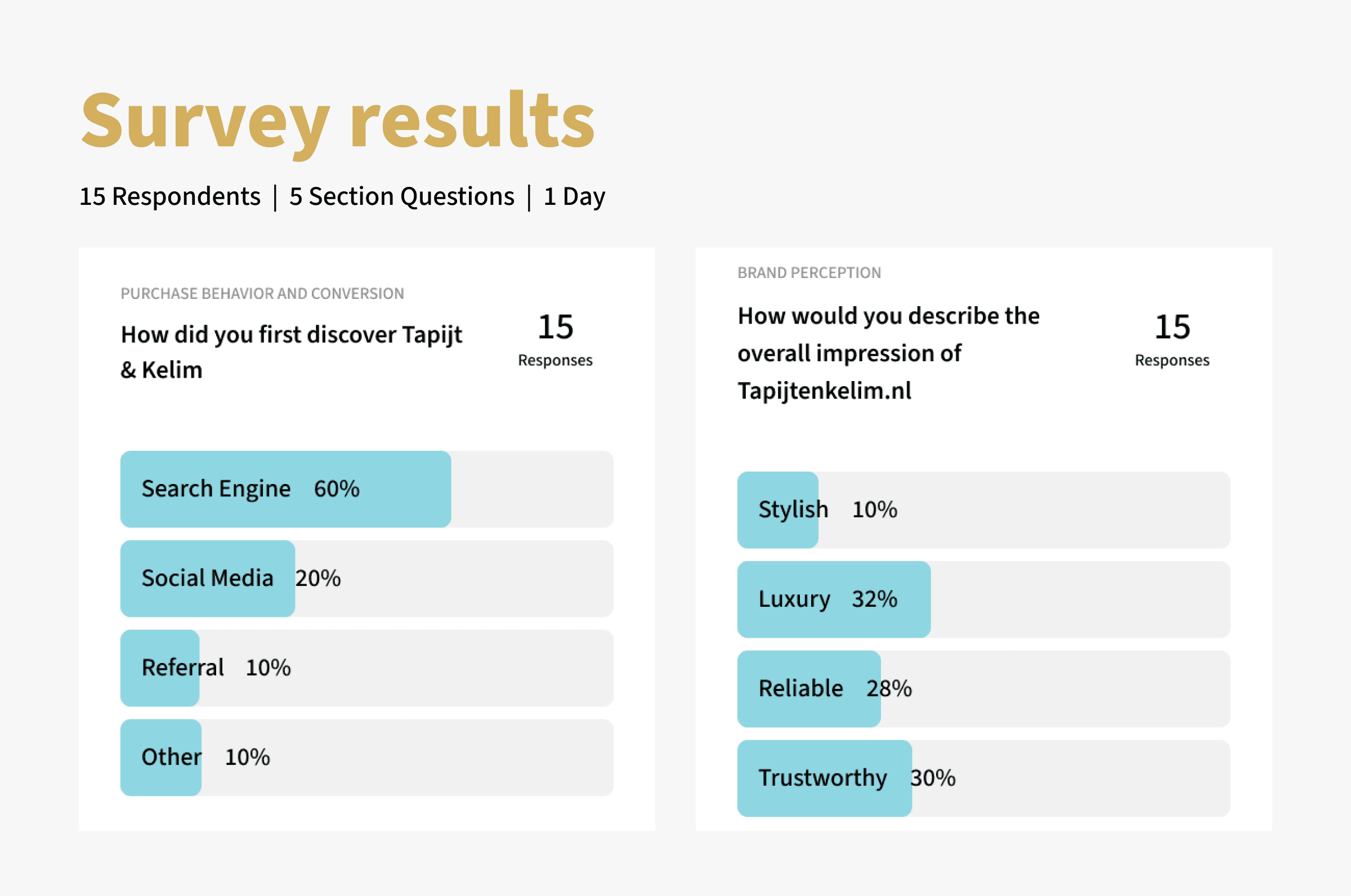
I analyzed the survey responses to identify trends, areas of strength, and opportunities for improvement.
Heatmaps
I used a heatmap tool to track user interactions and visual attention on the website. With that, I understood how people interact with the landing page.
The goal was to;
Understand how users navigate and engage with different sections of the website.
Identify areas that may be confusing or overlooked.
Optimize the placement of key elements (e.g., call-to-actions, product images) for better visibility.
The data from the heatmap was used to identify areas with high and low user engagement, guiding design adjustments and content optimization.
And then, back to the artboard. I continued to iterate the designs to strengthen our value propositions and ensure all messaging are clear as crystal.
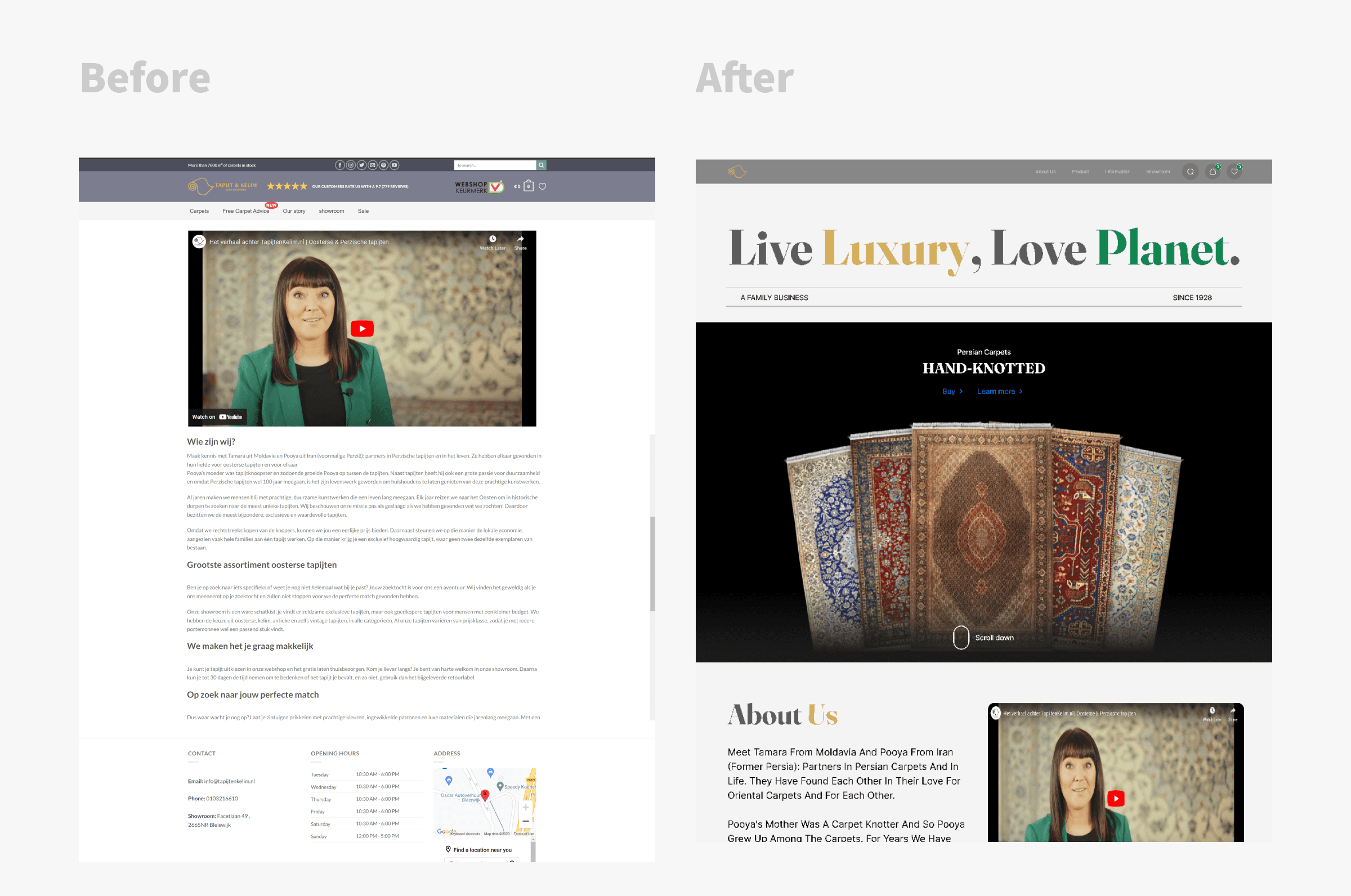
Before and after
Before the redesign, there was lack of focus on what Tapijt & Kelim offers. The website was cluttered. The design language was inconsistent with the brand's history and culture. It does not do justice to Tapijt & Kelim's unique value proposition.
Here's a detailed walkthrough of what I improved post-testing.
Strong social proof
A Trust & Review page was created alongside an Information page. With these pages, we showcase familiar brands that visitors instantly recognize, real metrics of satisfactory purchases from Tapijt & Kelim's customers, real reviews and real testimonials.
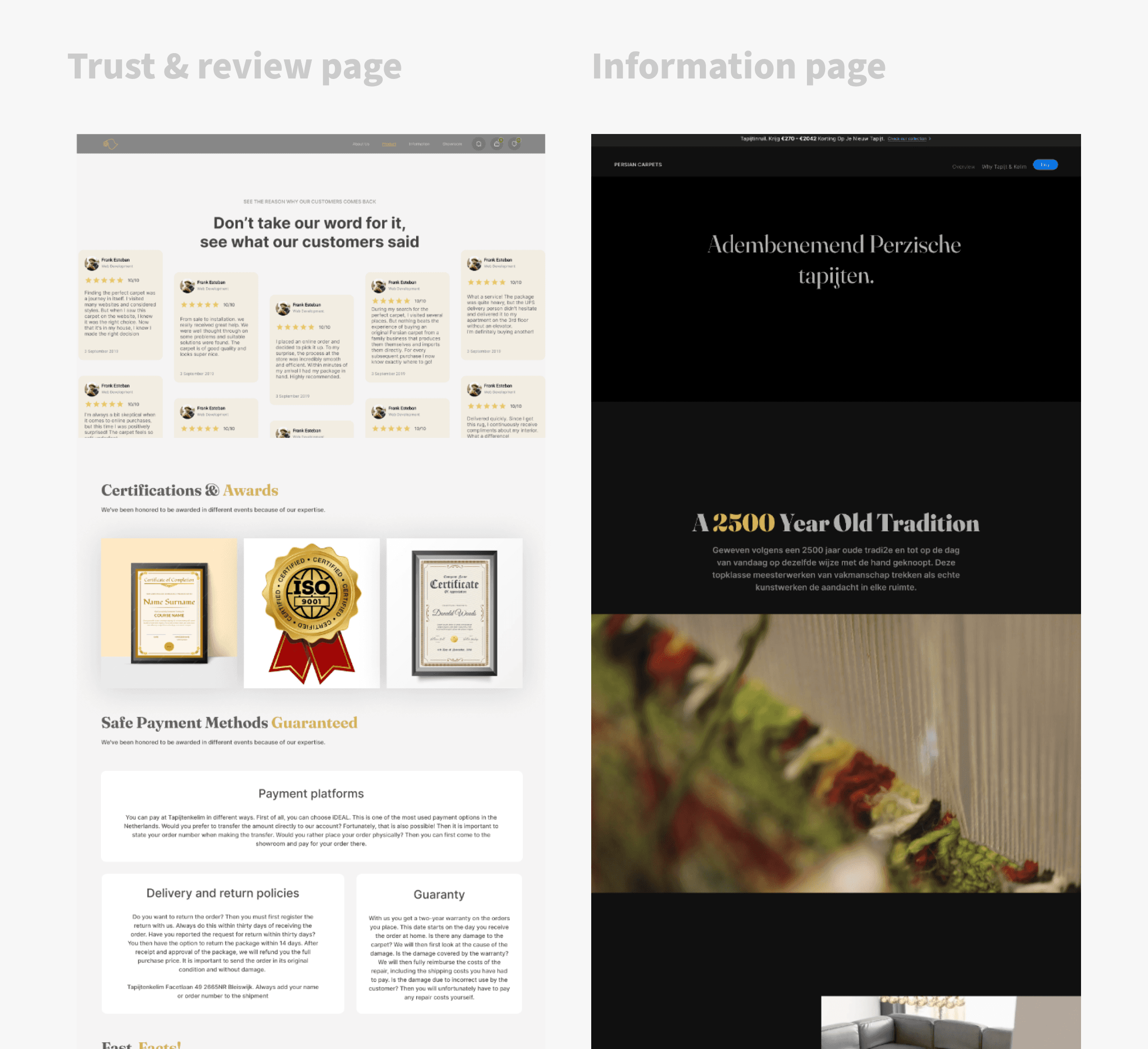
The information page was purposefully made to be in dark mode since a lot of videos, interaction and animation were arranged on that page. The main aim for the page is storytelling (the hero section for the information page starts with a video).
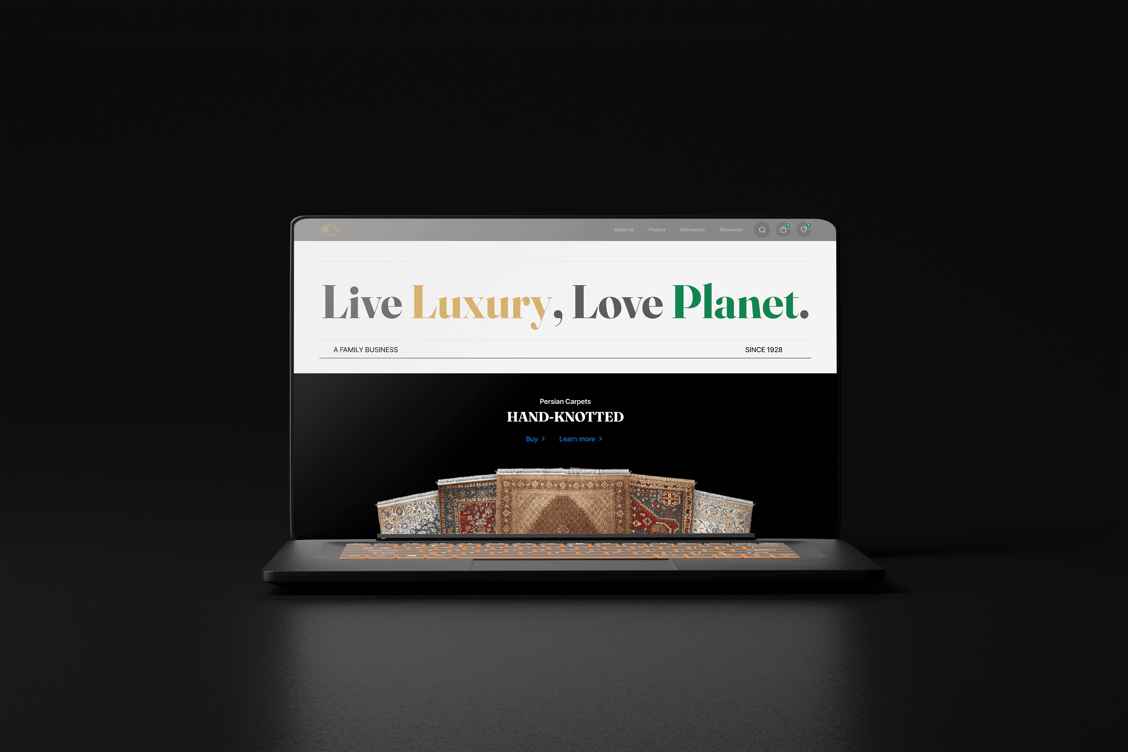
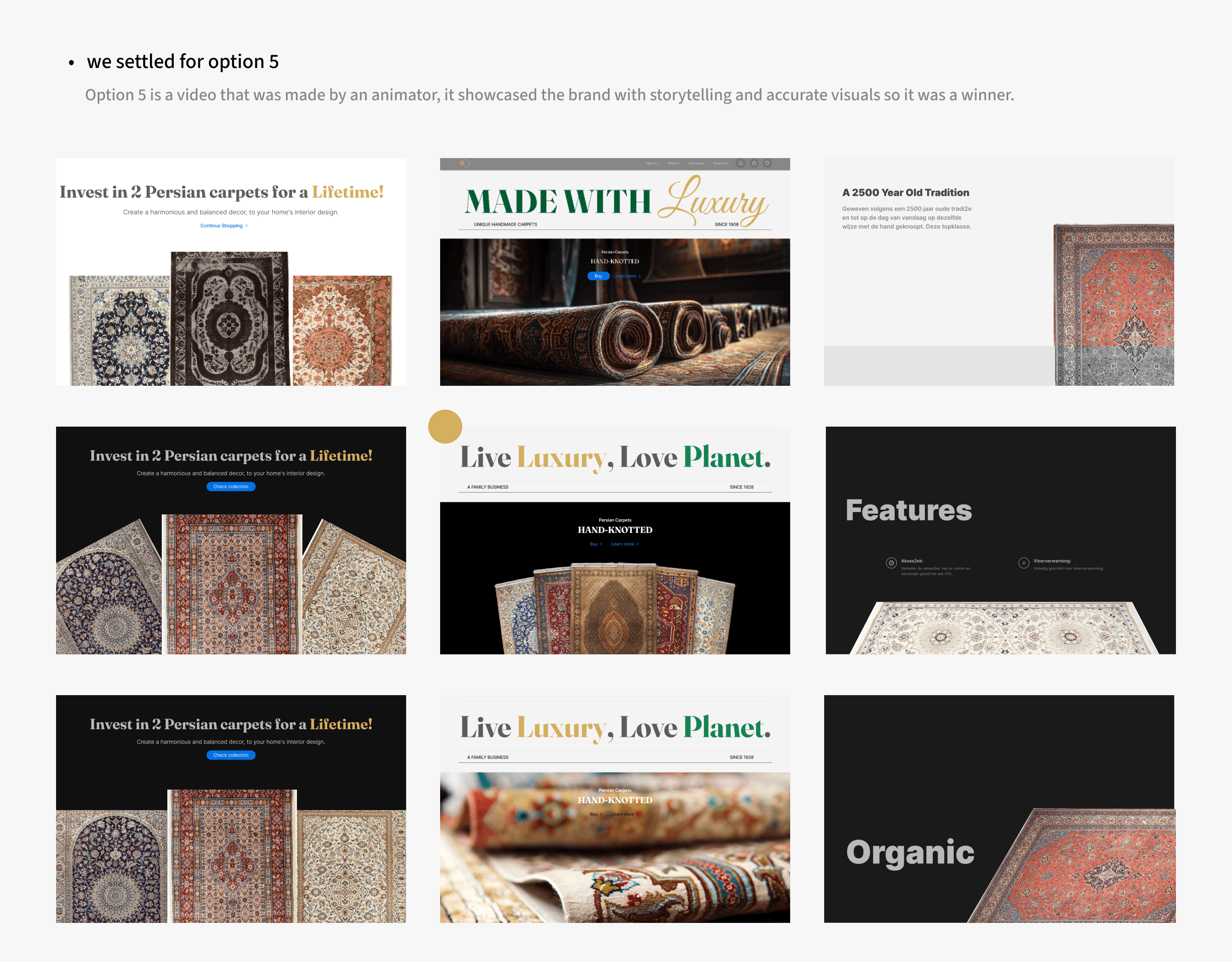
Relevant hero image
I designed 3 hero sections with different images so the team can visualize how it looks like. We voted on the design that best focuses on the carpet made by Pooya and Tamara (not a random image).
Responsive screen sizes
I maintained a consistent user experience across all devices, making it easy for customers to browse and purchase rugs regardless of their preferred device.
One of our goals was to boost search engine rankings by prioritizing mobile-friendliness
The responsive design allowed for the dynamic resizing and adjustment of product images to fit different screen sizes. Some of our users testified that the ease of viewing the rugs in high-quality detail, regardless of whether they were using a desktop, tablet, or smartphone made their experience delightful.
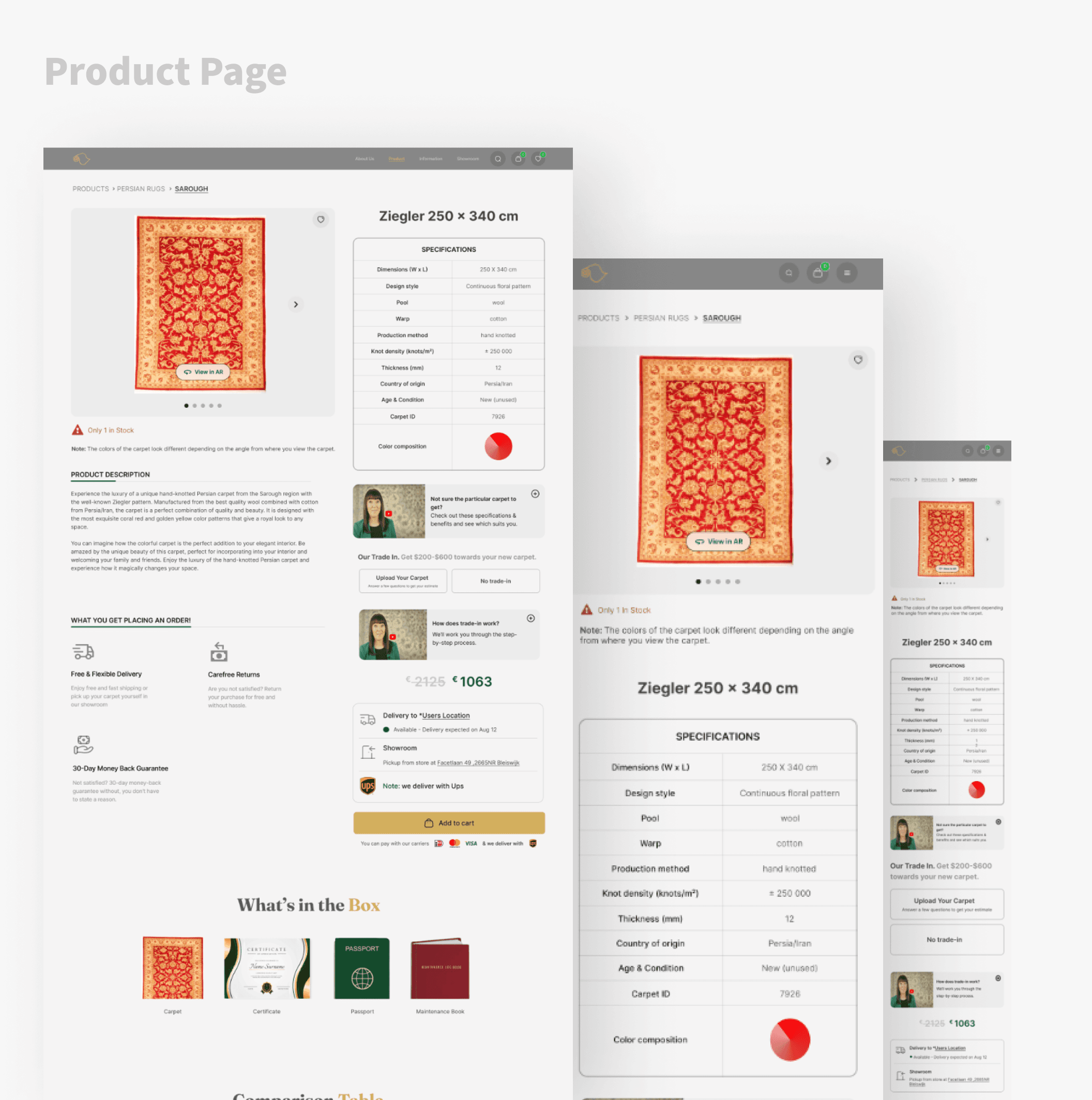
Responsive screen of the product page (Desktop, Tablet & Mobile)
Strategic Animation Placement
To avoid distracting users from the primary goal of purchasing carpets, I strategically placed animations and major interactions on specific pages that enhanced the storytelling aspect of the website.
This approach ensured that animations were used to complement the overall user experience and drive conversions, rather than becoming a distraction.
Iterative Design for Optimal Results
The Tapijt & Kelim's website redesign demonstrated the importance of an iterative design process. While initial testing favored one design approach, implementation revealed that a different solution was ultimately more effective.
By remaining flexible and open to adjustments based on real-world data, I was able to refine the design and achieve our desired outcomes.
The Power of Collaboration
As the solo designer on the Tapijt & Kelim's redesign, I recognized the value of seeking feedback and collaboration from other designers and developers. By acknowledging my own limitations and actively seeking input, I was able to enhance the design, identify potential issues early on, and ensure a more comprehensive and successful project outcome.
Take it one step at a time
I learned to break down complicated designs into small, manageable chunks. This eases development and handles bugs as we go along.
I no longer work at Tapijt & Kelim but If I had the opportunity to continue to contribute to their business goals, here are my future plans for the website:
Enhancing Landing Page Conversion Rates
To further boost the business value of the Tapijt & Kelim landing page, I would focus on strategies to increase conversion rates. This can include "Experiment with different CTA placements, wording, and design elements to increase click-through rates and encourage visitors to take action", "Showing limited-time offers, countdown timers, or scarcity messaging to encourage immediate purchases".
To maintain and update the landing page
As the product designer responsible for maintaining and updating Tapijt & Kelim's landing page, I would prioritize a data-driven approach. I would regularly monitor key performance indicators (KPIs) such as click-through rates, bounce rates, and conversion rates to identify areas for improvement.
Continue to maintain the interest of customers
Create content tailored to specific seasons or holidays to stay relevant and attract seasonal shoppers. Also, showcase new product offerings or limited-edition collections to maintain customer interest.
And that's it!
I really enjoyed the process from ideation, design, testing to development of this project. Couldn't have done so without the smooth teamwork with the Founder and Developer!
Thank you for reading through! Hope you enjoyed learning about my design and thought process. :)